ALL YOU NEED TO KNOW ABOUT FONTS AND FONT DESIGN
In typography, a typeface is a set of one or more fonts, in one or more sizes, designed with stylistic unity, each comprising a coordinated set of glyphs. A typeface usually comprises an alphabet of letters, numerals, and punctuation marks.

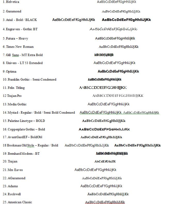
MY Top 25 Best Fonts Of 2010 - Below you will find the full list of the best and most popular 25 fonts we used last year.

Have you ever had the problem of not knowing what typeface to use? Well of course you have, everyone has. This is a guide on how to choose a font.
These pointers have been gathered from Robin Williams great book “The Non-Designers Type Book” that I recommended in the top 5 typography resources of all time.
Think about each of these before choosing your next font.
Choose a category of type
Choose a type face that you think will match your work. ie. Oldstyle, Modern, Slab Serif, Sans Serif, Script, Decorative.
Quality of printer & paper
Where are you getting your piece printed? If you are printing from a low resolution printer, your subtle font characteristics such as delicate serifs or fine lines will not get printed. (eg. fax machines, photo copier). Is the paper going to without the ink and quality? eg. Newspapers will absorb ink and lose finer details.
How much text is there to read? What is its purpose?
Are you designing for a sign, billboard, poster, a book, a report? What is more important – readability or aesthetics? What is the purpose of the text? A serious look, a casual look, a decorative look?
How much space do you need to fill? Or leave unfilled?
Different typefaces take up different amounts of space, even at the same point size. Try comparing two fonts next to each other and see how much difference they take up in room.
Is the project to be skimmed or be really read?
Choose a typeface and layout that suits its purpose.
An exercise method for next time you choose a font…
Know your output method and final reproduction process to narrow down your font choices.
Decide on the look you want to convey.
If you use more than one font, make sure the fonts are very different from each other. If they are not very different it looks like a mistake. eg. Use an oldstyle font for the body text and and a bold sans serif for the headline.
Don’t be afraid to use wild fonts where they are appropriate and use it sparingly. Don’t be a wimp.
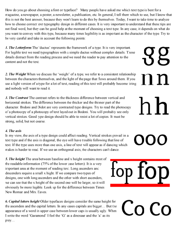
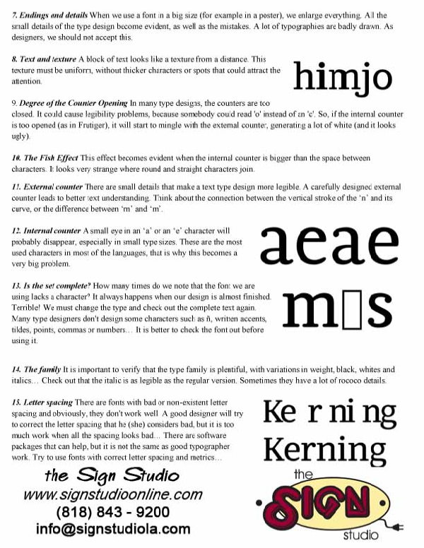
How do you go about choosing a font or typeface? Many people have asked me which text type is best for a magazine, a newspaper, a poster, a newsletter, a publication, etc. In general, I tell them which to use, but I know that this is not the best answer, because they won't learn to do this by themselves.
Today, I want to take time to analyze how to choose correct text typography design in different cases. It is very important to understand that these tips are not final word, but they can be good help at the moment of choosing a text type. In any case, it depends on what do you want to convey with this type, because many times legibility is as important as the character of the type. Try to be very careful and take in account the following points:


