Does Your Sign Stand Out Or Does It Compete For Attention?
Signs Competing for Attention
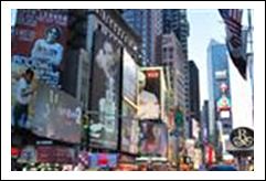
Even if your sign looked good when it was alone on your computer screen, look what can happen when it lands in its final location, perched high up on a building. Your sign could lose impact when seen from the landscape of visual noise.
After walking through this scenario in Times Square, I asked some people if any one message stood out in their memory, to which they each replied "no". There was no "take away" message, no "call to action" that stuck in their minds after being exposed to this cluster of signage. Too many messages competing with one another do not result in a communication delivered to your audience.
When you are considering signage, or where to place a sign, take into account the surroundings it will be viewed in. You don't have to be considering a location like Times Square in New York. Even if you are designing signage for a tradeshow at a hotel or large hall venue, consider the competing signage and messaging that will exist there.
Design something that stands out amongst the visual noise. Don't just look at a design proof of your sign by itself only, but place it against a photo background of similar noise and distraction. This will help you see what needs to be done to get your message seen against a busy background.
A confused, unclear and unfocused sign is one that includes more information than is necessary.
Take the care to edit your message to its essential minimum-and think about the "white space" so to speak. Especially in a busy environment, such as a trade show or office lobby, you need to clear away a space so your message can be seen. It needs to "pop out" from the background scenery.
Where communicating an announcement or featuring a product, design your sign for quick, brief attention. Think about whether you want it seen at mid-distance or up close-or both.
In the "After" example above, the product is more visible and flows right into the text message. Before, it was sitting inside a white box by itself, not totally integrated with the whole.
As you can see, it's important to put some thought into how to best arrange any visual message.
If you have any further questions or need any help, please give us a call at The Sign Studio (818) 843-9200 or send us an e-mail at info@signstudiola.com.
