Southern California Sign Blog

Burbank Sign Co. | Polished or Brushed Metal Letters For Your Sign

Posted by Julie and Chris Ramirez on Sun, Dec 23, 2012 @ 06:12 AM

SOLID METAL LETTERS - How beautiful and elegant they really are!

Solid Metal Letter Image


STAINLESS STEEL LETTERS

- Satin Grained Face or Polished – you just can’t go wrong with the look, absolutely gorgeous! Available sizes from 1” - 48” with thicknesses that range from 1/8” – ½” / Waterjet Flat Cut from solid 304 Alloy.

ALUMINUM LETTERS

- Satin Grained Face or Polished – Great pricing! Great look for economical prices. Available sizes from 1” – 48” with thicknesses that range from 1/8” – ½” / Waterjet Flat Cut from Solid 5052 Alloy.

BRASS LETTERS

- Satin Grained Face, Oxidized or Polished – Very Classy look! Available sizes from 1” – 48” with thicknesses that range from 1/8” – ½” / Waterjet Flat Cut from Solid 260 Alloy.

COPPER LETTERS

- Satin Grained Face, Mirror Polished, Verde Patina – Breathtaking! Available sizes from 1” – 48” with thicknesses that range from 1/8” – ½” / Waterjet Flat Cut from Solid 110 Alloy.

For further information or quotes, please contact us at The Sign Studio (818) 843-9200 or send us an e-mail with your request thesignstudio@sbcglobal.net.

NEED QUOTE

Sign Quote


Topics: Burbank Sign Company, Metal Letter Signs, Brushed and Polished Metal Letters

Burbank Sign Company | ADA Signs With Braille & Tactile Guidelines

Posted by Julie and Chris Ramirez on Sat, Dec 22, 2012 @ 06:12 AM


The ADA Tactile & Braille Signage Code is a wide-ranging civil rights law that prohibits, under certain circumstances, discrimination based on disability. The lack of accessibility or certain services can be considered discrimination, regardless of who it actually affects. This creates a need for ADA compliant signs. No individual may be discriminated against on the basis of disability with regards to the full and equal enjoyment of the goods, services, facilities, or accommodations. When the law was first put into effect, there was a problem with ADA signs not being esthetically pleasing. Now that it's been in existence for some time, the question of esthetics has been resolved and the industry faces new problems with ADA signs. We continually add articles to this section, so be sure to check back often.

ADA Guidelines
Letters can't be smaller than 5/8-inch or larger than 2 inches. All letters must be a minimum 3/32 inches thick for tactility. And, generally, you cannot use elaborate or decorative fonts. San Serif fonts, like Helvetica, are the staple of most ADA signs. It may sound restrictive, and it is at some level, but the goal is not to stifle creativity. The goal is to serve an intended audience.

While ADA guidelines define font size, contrast and other criteria, the law does not define specific design criteria as it relates to aesthetics. Letter height, Braille placement, font, and color contrast make only minimal impacts on the visual appearance. There are ways to make ADA signage more attractive while still adhering to the guidelines.

ADA Materials
ADA-compliant materials are one way to make the difference between a ho-hum sign and an attractive presentation. Sign frames with the ability to change printed inserts are another. Finally, understanding what the guidelines really say about color contrast and icons could give you more freedom than you thought. Signs can be designed and made from an amazing variety of materials ranging from basic plastics to very elaborate designs of natural stone, woods, or metals.

For further information or questions, please call The Sign Studio (818) 843-9200 or e-mail us at thesignstudio@sbcglobal.net

NEED QUOTE

ADA Sign Image


Sign Quote

Topics: ADA Restroom Signs, Burbank ADA Sign Company, ADA Braille & Tactile Signs

Burbank Sign Company | Do You Want To Install Your Banner?

Posted by Julie and Chris Ramirez on Fri, Dec 21, 2012 @ 06:12 AM

Want to save money and install your own banner? If so, here are some typical banner installation methods. Banners are generally installed using one of these four methods.

The Sign Studio, Burbank, CA, Banner Installation, banner install methods, banner maintenance, banners la, banners los angeles

NEED QUOTE

Sign Quote

Topics: Banner Installation, Burbank Sign Company, Banner Install Methods

Burbank Sign Company | Architectural Sign Design With Precision

Posted by Julie and Chris Ramirez on Thu, Dec 20, 2012 @ 06:12 AM

ARCHITECTURAL SIGNAGE- Does more than communicates a message. Architectural signage must also help build the brand name of the company it serves. Success depends not only on precision craftsmanship but also on cutting edge design and carefully selected materials that will best represent the finished product.

Planning for Precision and DurabilityArchitectural signs
Creating quality architectural signage means understanding the details and planning for the obstacles involved. The challenges are somewhat different depending on whether you are creating signage for indoor or outdoor use.The challenge on indoor signage is to have a degree of precision that is unsurpassed. With exterior signage the tolerances do not have to be quite as precise, but there are other challenges that are just as significant, such as weather conditions and environment. Interior signs are in air conditioned environments but with exterior items we have to worry about sunlight, humidity, heat, cold and so on.

Understanding How Lighting Impacts Display
Fade resistant materials are important to protect both indoor and outdoor architectural signage from the sun and understanding the impact of ambient lighting is also a key challenge.

Choosing the Right Materials for the Job
Between durability and lighting concerns, choosing the right materials for architectural signage can be a major obstacle for the novice. Avoid lower end plastic products, they look cheap.

Special Considerations in the Design Phase
The actual "look" of a sign is the focus of most everyone's attention. The primary challenges in the design phase is coming up with a look that the everyone wants and choosing materials while staying within budgets. It is important to choose materials in the design phase so that you can prepare for any special requirements, such as lighting, mounting, or curved walls.

For further Information or if you have any questions, please call The Sign Studio @ (818) 843-9200 or send an e-mail to thesignstudio@sbcglobal.net.

Sign Quote


Topics: Burbank Sign Company, Business Architectural Signs, Commercial Sign Design

Burbank Sign Company | Sign & Banner Color Chart

Posted by Julie and Chris Ramirez on Wed, Dec 19, 2012 @ 06:12 AM

Different colors and fonts appeal to different personalities, and if you really want signs that attract, you'll make an effort to understand to whom what color goes with your personality. Here are the most common examples and top 3 colors used:

The Sign Studio in Burbank CA - Sign Color Chart

Red: Red is exciting and active - it suggests boldness and efficiency, and is appetite-inspiring, hence McDonald's use of red (as well as yellows and oranges). As you can see, red especially appeals to "Emulators," or people who are sales-oriented and talkative. Red implies urgency.

Blue: Blue is the most widely used color in appealing to businesspeople and entrepreneurs called "Achievers." Blue is serene, suggesting wisdom, dignity, and stability, hence the wide use of blue by banks. Men prefer blue to red and are supposed to prefer blue to red because it is more restful to the eye. Blue is businesslike.

Green: Green and other earth-tone colors appeal to the vast group called "Belongers." These people are the "middle America" people - usually employees, family people, and definitely relationship-oriented. They enjoy green, browns and golds. Earth-tones are friendly.

For further information see our -LETTER VISIBILITY AND COLOR CHART

If you are interested in more color analysis or color combinations, please give us a call at (818) 843-9200 or send us an e-mail at info@signstudiola.com

Sign Quote

Topics: Burbank Sign Company, Logo Design, Sign & Banner Design

Burbank Sign Company | Floor Sign Graphics & Window Decal Clings

Posted by Julie and Chris Ramirez on Tue, Dec 18, 2012 @ 06:12 AM

Floor graphic advertising is a unique way to put your message in front of and under current and potential customers.

Floor Graphics

If you advertise in a supermarket, convenience store, exhibit hall or airport, you're constantly battling other posters and signage for awareness. Why not try something unique, something that will make you stand out from your competition? With point of purchase floor graphics from The Sign Studio, you'll have a unique tool to capture your customers' interest and encourage a call to action.

Customers tend to look down as they push shopping carts or wait in line to purchase their selections and a floor graphic, or decal or cling, is an easy, cost-effective way to grab their attention. It's especially valuable in driving last minute or impulse purchases. In fact, floor graphics can increase these purchases by 10%!
The Sign Studio has been producing and printing custom floor graphics for years. We understand the industry tricks, including bold graphics, strong messaging and die-cuts, to get your floor graphic noticed. Plus, we have the printing capabilities that make your graphics durable and long-lasting, so you can reach your most important customers day after day.

Contact The Sign Studio today to discover how and what we can do for you in an effort to increase your visibility in today's competitive marketplace. The Sign Studio - (818) 843-9200 or e-mail info@signstudiola.com

NEED QUOTE

Sign Quote

Topics: Burbank Sign Company, Floor Sign Graphics, Window Decal Clings

Burbank Sign Company | What Successful Signs Can Do For You!

Posted by Julie and Chris Ramirez on Mon, Dec 17, 2012 @ 06:12 AM

Signs and graphics serve three general purposes: to inform, direct and sell. The initial impression a person has about a business is often the result of their signs and graphics. By employing effective signs and graphics, businesses of all types and sizes can make the most of that first impression.

Signs are valuable to businesses of all sizes, and in all industries. Signs help consumers become aware of a business, service or event, can help prompt purchases, change purchase decisions and build brand equity.

Signage is an inexpensive, yet very effective form of advertising. During a slow economy, advertising is crucial and it helps create a long-term competitive advantage. Maintaining an advertising presence through signs helps build long-term brand awareness.

Effective signage can also be a determining factor in influencing customers to switch from a weaker brand. What can effective signs and graphics do for you?

Sign Images

Contact The Sign Studio @ (818)843-9200 or send us an e-mail - info@signstudiola.com.

Sign Quote

Topics: Burbank Sign Company, Successful & Effective Signs, New Business Sign Design

Burbank Sign Co. | Your Checklist For Trade Show Graphic Signage

Posted by Julie and Chris Ramirez on Sun, Dec 16, 2012 @ 06:12 AM

Trade Show Graphics Checklist:

Your Sign Studio consultant knows all the tricks of the trade show. We'll help you: Create a striking design that communicates a clear message and business image. Distill your product information into easy-to-read, bullet-pointed copy. Choose the right color scheme that complements your logo and shows off your products. Select a booth and graphic materials that are durable and lightweight for easy, affordable transport and storage Strategically position graphics to guide traffic flow in and out of your booth space. Keep your trade show booth on budget while also achieving a highly effective, professional look.

The Sign Studio has everything you need to create a powerful trade show exhibition. 

Go to our Electronic Catalog -Exhibitors Handbook for ideas and suggestions. 

Contact The Sign Studio at (818) 843-9200 or send us an e-mail at info@signstudiola.com for assistance.

Sign Quote

Topics: Burbank Sign Company, Exhibitors Handbook for Tradeshows, Trade Show Sign Displays

Burbank Sign Co. | All You Need To Know About Channel Letter Signs

Posted by Julie and Chris Ramirez on Sat, Dec 15, 2012 @ 06:12 AM

Channel Letter Glossary - Need a quick channel letter term definition? Here are a few common ones:

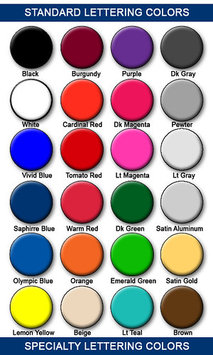
Acrylic: Translucent plastic used as a channel letter face material. Acrylic is available in a wide of colors, and its thickness is typically 1/8" or 3/16".

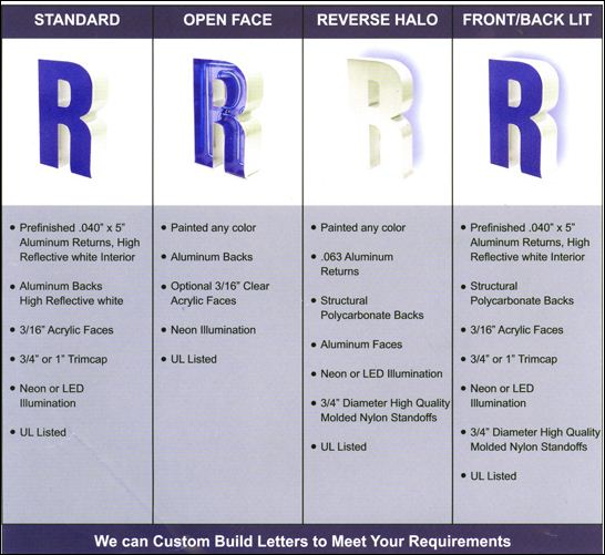
Channel Back: Aluminum that is routed in the shape of a letter to form its backing.

Cut-off switch: Electrical switch placed on the outside of the building, usually above, below or on a channel letter signs raceway.

Drain holes: Small holes placed at the bottom of a channel letter. Drain holes permit rain and condensation to drain out of a letter's interior.

Electrode: The terminal at the end of a neon tube that connects to a GTO wire. Neon tube fabricators attach electrodes to glass tubes by melting the glass to form an airtight weld.

GTO cable: Insulated electrical wire designed for high-voltage current. GTO cables connect neon tubes.

Electrode boot: A rubber boot designed to be installed on the double back or electrode of a neon tube to protect against electrical shocks or arcing.

LED: An electronic light source for channel letters. LED stands for Light Emitting Diode, and this type of lighting is illuminated by the movement of electrons in a semiconductor material. LED Channel letters are becoming more and more popular.

Neon: Another illumination option for channel letters, neon is a luminous glass tube filled with inert gas. High voltage electricity from a transformer excites the gas to produce light. Tubes may be bent to form various shapes and letters.

Permit: A legal document required by a municipal building department that allows the installation of a specific sign at a designated location. It is illegal to erect a new sign without first obtaining the appropriate permit.

Polycarbonate back: A protective plastic insert cut to the same shape as a reverse channel letter and attached to seal the letter's back. This prevents rainwater entry and also keeps animals from nesting inside the letter. Polycarbonate backs also provide mounting surfaces for neon tube supports.

Raceway: An enclosed aluminum channel (typically 8" by 8") that spans the entire length of the letters. Channel letters are pre-installed on the raceway in the shop, thus simplifying installation in the field.

Return: The side of a channel letter. Returns are commonly constructed of aluminum, and are typically 5" deep.

Tie wire: Thin copper wire that attaches a neon tube to a tube support.

Transformer: A channel letter's high-voltage power supply. Transformers are available in various current outputs, typically ranging from 7500V to 15,000V.

Trim cap: The flexible plastic edging that surrounds a channel letter's face. Trim caps are chemically welded to the face, and are available in a variety of colors.

Tube support: A glass standoff that typically is fastened to a channel letter back to hold neon tubing in place.

UL-approved: Underwriter's Laboratories (UL) is an independent product safety certification organization. UL approval means that all sign components meet UL standards for electrical safety.

Channel Letter Sign Image

If you have any questions, please give us a call at The Sign Studio - (818) 843-9200 or send us an e-mail at thesignstudio@sbcglobal.net

NEED QUOTE

Sign Quote

Topics: Burbank Sign Company, Custom Signs, Channel Letter Sign Quote

Burbank Sign Company | RTA Vinyl Lettering, Logos and Graphics

Posted by Julie and Chris Ramirez on Fri, Dec 14, 2012 @ 06:12 AM

READY TO APPLY LETTERING - also known as RTA Lettering.

If you are looking to save yourself some money and are confident in your application abilities, the following directions on how to apply your own vinyl lettering will help you to install your own signage.

1. Apply window cleaner, soapy water, or denatured alcohol to clean the surface where the lettering will be placed. Use a lint-free cloth to wipe the surface dry.
2. Use a water-soluble pencil to draw guidelines and centerlines to help align the lettering.
3. Fill a spray bottle with a mixture of water and 3 drops of liquid dish detergent.
4. Before applying, rest the lettering on a flat surface and carefully squeegee across the transfer tape that covers the bottom.
5. Find the center of the lettering and make a small mark at that point on the transfer tape.
6. With the lettering face down, peel the backing paper away from the lettering, which will remain adhered to the transfer tape.
7. Lightly spray the exposed sticky side of the lettering with the soapy water solution (if the letters are being applied to glass and are smaller than 1" in height, do not use the spray, it could cause misalignment.) Small letters should be applied dry.
8. Place the lettering and transfer tape onto the surface, using any guidelines and centerlines you have made to help align the lettering.
9. Squeegee the lettering from the center outward toward the edges, overlapping your strokes to prevent air and water from being trapped under the lettering.
10. Leave the application tape attached to the lettering and let it dry for about one hour.
11. Remove the application tape. Put the tape back at a 180-degree angle (flat) to the surface. This will minimize the chance of the lettering being pulled up along with the tape.

If you have any questions of need help with your Installation, please give us a call at (818) 843-9200 or e-mail us at thesignstudio@sbcglobal.net.

The Sign Studio, Burbank CA, RTA signs, vinyl graphics, vinyl application, vinyl signage

Sign Quote

Topics: Burbank Sign Company, RTA Vinyl Lettering Signs, Vinyl Graphics & Logos