How To Design Your Sign / Banner From The Sign Studio - Los Angeles
Whether you’re designing/buying a full color banner/sign or sticking to very limited colors, you want to choose colors that will make your sign/banner easy to read. Typically black letters on
a white banner give you the absolute best contrast, but they’re also kind of boring. Here are some other better color combinations for your banner:
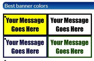
Black letters on a yellow banner. This is your best option because it stands out better than a white banner, but the black letters still have high contrast on the yellow background, so they’re easy to read.
Black letters on a white banner. You can jazz up this simple combination by using full color logos or graphics, or adding a colored border around the banner.
Dark blue (navy) letters on a white banner. Once you start using colored letters, it’s better to stick to a white background, and the darker the letters are the easier they are to read.
Dark green (forest) letters on a white or very light cream banner. Sometimes a cream colored background can help you match your company colors or just make the banner look a little more natural, but make sure to keep it light so that your words stand out against the colored banner.
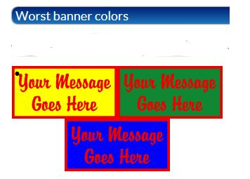
Red letters on a yellow banner. This is a popular color combination, but the reason it’s not a good choice for a banner is that red and yellow don’t provide much contrast. Red letters on a white banner would be a better choice because they will be easier to read. Or if you’re buying a full color banner, you could do part of the banner as red on white and part of it as yellow on black. It all depends on your preferences and your logo, if you are putting the logo on the banner.
Red and green right next to each other. If you’re making a Christmas banner, you’ll want to use a white background and alternate red and green text. If you try to put red text on a green banner, or green text on a red banner, you’ll end up with a very hard to read banner.
Red and blue right next to each other. Just like red and green, these colors shouldn’t touch. Separate them with some white space and you will make your banner much easier to read.
Take some time to experiment with different color combinations, but try to stick to high contrast so that your banner will be easy to read. After all, the whole point of displaying a banner is for people to read it.
For further information, please view our Visability Chart.
Also available for download is our Guide To Color Choices.

If you have any questions or need assistance with anything, please give us a call at The
Sign Studio (818) 843-9200 or send us an e-mail at info@signstudiola.com. From Concept to
Finish The Sign Studio is here for you – On time and on budget!
NEED QUOTE
Vinyl Banner Adhesive Vinyl Indoor Stands
Banner Blockout Adhesive Clear / Translucent Outdoor Stands
Banner Backlit Adhesive Window Perf Lightbox
Mesh / Smooth Vehicle Graphics /Wall Graphics Sidewalk Signs
Window Static Cling Floor Graphics
Premium Vinyls Signicades
Paper Posters Reflective Vinyls Plasticades
Scrim Banner Metallics /Gold / Silver Retractable
Printable Fabrics Chalk Vinyls Post & Panel Signs
Photo Paper Valet Parking Signs
Overlaminates Simpo Sign Frames
Pedistal Signs
Wind Spinners
Real Estate Frames
Trade Show Displays
RIGID SIGNS
Foamcore
Coroplast
PVC Board
OTHER SIGNS
ADA Signs - Restroom / Handicap
Parking Signs
Regulatory Signs
Construction Signs
Acrylic Displays
Golf Signs
Commercial Signs
Dimensional Letters
Digital Imaging Signs
Electrical Signs
GEMINI Products
Vista Systems
Signicade/Plasticade Distributor
The Sign Studio also provides maintenance and service calls
on all signs. We proved service to the
following areas:
Los Angeles, West Hollywood, Hollywood, Studio City, Century
City, Santa Monica, Culver City, Burbank, Pasadena, Glendale, Tarzana, Woodland
Hills, Anaheim, Arcadia, Alhambra, City of Duarte, West Covina, El Monte,
Toluca Lake, Universal City, La Crescenta, Whittier, Buena Park, San Fernando,
La Canada, Cerritos, City of Lakewood, Glendora, Compton, Long Beach, San Fernando, Sylmar
