HOW BIG SHOULD I MAKE MY SIGN LETTERS
Lettering size is an important part of sign making because you will need to be sure that your clients can read your message from a distance. Whether it’s storefront window graphics, a banner, or vehicle graphics, make sure that you can read the lettering and logo contained in your message. To maximize readability the standard is that each inch of letter height represents 10 feet of readable distance, meaning that for a sign to be readable from a 30 foot distance the letters should be at least 3 inches tall.
Interior signs that are being read by customers in a retail
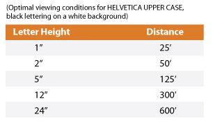
store environment need only be an inch or two tall, while an overhead exterior banner being read from a nearby street or highway would need much larger letters in order to be seen from a distance. Also, font selection will play an important role as some fonts are thin and script like, while bolder fonts and capitalization (with appropriate spacing) can improve readability. Trying to skimp or economize by using a smaller lettering size is definitely not a wise decision. See The Sign Studio’s Legibility/Readability chart below for an example assuming Helvetica upper case black lettering on a white background.
READABILITY/LEGIBILITY CHART
If you have any further questions or need any signage information, please give us a call at (818) 843-9200 or send us an e-mail at thesignstudio@sbcglobal.net.
Need a Quote from The Sign Studio?