Your sign is usually your first chance to make an impression and attract customers, so you want to do everything possible to make it effective. Below are general design tips for creating great looking, appealing signs. Our expert designers consider these and many other factors in building a truly appealing visual presentation for you.
Speed and Legibility
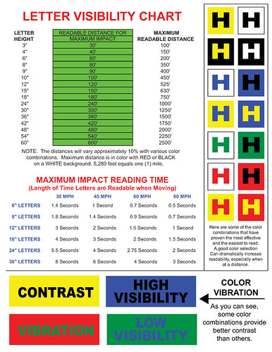
Potential customers passing by in moving vehicles have very little time to read signs. Make yours a quick read by following these proven guidelines:
1. Do not crowd the sign. Avoid the temptation to list every product and service you offer. Keep it simple. One message is all a viewer can absorb in a few passing seconds.
2. Use "white space" to frame your company name or message. A busy sign makes it difficult for a reader to find a focal point and begin reading. Adding a border to the sign also increases legibility.
3. Make sure the fonts used are legible and letters distinguishable from their surroundings. Make sure they do not run together or get crowded by other graphics. Choose easy to read, san-serif typefaces.
Impact
Don't think of your sign as just a way for customers to identify or find your business. Create an appealing, powerful look that entices them to enter, shop and buy. Incorporate fundamental design principles such as:
1. Alignment and Proximity: Make sure elements that are relevant are grouped together and properly aligned.
2. Balance: Don't make one area of the sign so full that it outweighs the rest.
3. Information Hierarchy: Present the most important information first. Readers will view your sign from top to bottom and left to right.
4. Focal Point: Create a strong "point of entry" for your sign. Let the reader know where to begin reading.
If you have any further questions or need any information, please call The Sign Studio (818) 843-9200 or send us an e-mail at thesignstudio@sbcglobal.net.
NEED QUOTE