Southern California Sign Blog

Julie and Chris Ramirez

Recent Posts

Los Angeles Signs | Trade Show Display Signage Is Your Message

Posted by Julie and Chris Ramirez on Tue, Jan 18, 2011 @ 07:01 AM

Your trade show display booth is the canvas for your marketing message. Get noticed with a custom trade show display from The Sign Studio.

A Few Seconds. That's all the time you have to attract potential customers to your trade show booth. Get noticed with portable tabletop displays, pop-up displays, retractable banners, motion displays and even ceiling and floor graphics. The Sign Studio's state-of-the-art digital printing capabilities can help you create a custom display that will grab attention and draw potential customers into your booth.
Portable Trade Show Displays, Pop Up Display

The Sign Studio offers what is considered to be the strongest portable display system in the industry as well as the easiest to setup and break down. Multiple configurations and unique modular design allows you to modify the size and shape of your portable display booth as your needs grow. The versatility and customization make The Sign Studio pop-up displays the perfect solution for your exhibit presentations all in lightweight and compact design.

Retractable Banner Stands
Retractable Banner Stands are the most popular banner stand in today's market and can be seen throughout most all Trade Shows. Retractable Banner Stands store the banner safely inside the base where it's protected during travel or in storage. Once on location, simply unroll the banner from the body of the unit to present an instant display that can be continually re-used.

Tabletop Display Booth
Looking for a simple way to showcase your services or products? Not interested in transporting everything but the kitchen sink to each show. Then the solution is simple; a compact and lightweight, inexpensive tabletop trade show booth from The Sign Studio! The ease of set up and break down makes our tabletop displays a cinch to handle.

Tradeshow Signage, Retractable graphic 
If you have any further questions or need more information, please call us at (818) 843-9200 or send us an e-mail at thesignstudio@sbcglobal.net.

Need A QUOTE

Topics: Los Angeles County CA, Custom Trade Show Signage by The Sign Studio in Bu, Tabletop Displays, Pop Up Display, Retractable Banner Stands

Los Angeles Signs | Safety and Danger Signs - Why do they matter?

Posted by Julie and Chris Ramirez on Mon, Jan 17, 2011 @ 08:01 AM

Why Do Safety Signs Matter?

Safety signs, tags and warning labels are an essential feature to any plant or business, and comprise one of its most important assets. By not using proper effective safety and warning signs, you run a risk of danger that isn't worth the risk.

Safety Signs 

Hints on Designing an Effective Warning Sign

To make your signs and labels as effective as possible, follow these hints.
 
1. Choose the Proper Header - The header helps get the sign noticed.
 
2. Choose the Right Material - Installation and ordering costs are often more than the sign itself. As a result, a durable sign always pays for itself with reduced labor.

3. Use Bilingual Warnings - Although the use of a symbol is strongly encouraged in order to better communicate hazard information across language barriers, more and more warnings themselves are now shown in two languages.

4. Learn about the New ANSI Standard - The new ANSI standard for safety signs emphasizes custom design. It suggests that you add an Action statement, consequences, a symbol, use mixed case and, in many situations, add emergency information.

If you have any further questions or if you need us to design and manufacture your signs, please give us a call at (818) 843-9200 or e-mail us at thesignstudio@sbcglobal.net

NEED A QUOTE

Topics: los angeles signs, Safety and Danger Signs, Custom Signs in Los Angeles and Burbank

Los Angeles Signs | Fair Pricing On Quality Wraps Are Worth It!

Posted by Julie and Chris Ramirez on Mon, Jan 17, 2011 @ 07:01 AM

Fair & Reasonable Pricing On Quality Wraps Are Worth It!

So often we look to economize, especially in light of the current economy. However, the old adage, "you get what you pay for," really does hold true, particularly when it comes to vehicle wraps. Here are some of the signs you should look for in evaluating the quality of a vehicle wrap:

• Check the bumpers. These are difficult to wrap given that there are lots of curves, nooks, and crannies. Make sure that premium wrap materials (cast vs. calendared) were used and that the material is not lifting, especially on the underside. This is sometimes an area were trimming, tucking and priming is sometimes overlooked.

• Are the grills and fenders wrapped? This is important if the grill and fender color of the original paint job does not match the new wrap colors. They should be wrapped to match!

• Make sure the door handles are wrapped with the same photorealistic image as the rest of the vehicle.

There's nothing worse than the original color door handles poking out from the image. I saw an example recently of a white door handle showing through on a matte black wrap!

• Make sure that seams are kept to a minimum, especially on the sides. It's possible to pay a little more to have full sheets printed so that there is less seaming necessary. Also, be sure to check the top and bottom of the vehicle to make sure that the original paint is not showing through. (Keep in mind that some people opt not to wrap the top of the vehicle because this area may not be visible or non-essential. This is more a matter of personal preference).

• Pay attention to placement and layout of the graphics, especially if the image includes faces. A face in the middle of a door handle may not be what you had in mind. Make sure that the designer tells you about any design glitches before the installation.

As you can probably tell from the discussion above, there may be reasons for that cheap price that you have been quoted. Don't settle for a "wrap gone wrong!" Have it redone. After all it's your image, branding and reputation that are at stake.

Vehicle Wraps & Graphics  

Call us at The Sign Studio (818) 843-9200 to make sure you get the quality vehicle wrap that you deserve. Or send us an e-mail with your questions or request at thesignstudio@sbcglobal.net.

NEED A QUOTE

Topics: Vehicle Wraps, Vehicle Graphics, Fleet Graphics, 3M Vinyl, Vehicle Design

Los Angeles Signs | Lifetime Warranty On Your Letters? Absolutely

Posted by Julie and Chris Ramirez on Sun, Jan 16, 2011 @ 18:01 PM

Lifetime Warranty On Your Dimensional Letters? Absolutely!

There are some instances when the signage you buy comes with a lifetime guarantee and Gemini lettering is just what comes to mind. Gemini has become a familiar supplier to many sign fabrication concerns for this very reason! The warranty covering lettering, custom logos and shapes extends to fading, breaking, as well as defects in the manufacturing process. This represents a true cost saving that protects your investment in this portion of your sign. Whether you order individual letters for mounting directly to your building or storefront, or integrate the lettering for mounting on an exterior post and panel sign or monument, the fact remains that you are making a very smart investment choice. The material finishes are rigorously tested to withstand extreme environmental conditions and this process is continually refined. Like most signs, periodic maintenance, like dusting and washing them with mild dish soap, will keep your lettering looking great for years!

Gemini Letters

The Sign Studio is proud to supply Gemini lettering, like the metal laminates pictured above, to our customers. Other options range from molded plastic, cast and cut metals, or metal faced lettering mounted to a variety of substrates. Feel free to consult with us about your choices in lettering style, size and mounting options, as well as Gemini aluminum and bronze plaques.

If you have any further questions or need more information, please call us at (818) 843-9200 or send us an e-mail at thesignstudio@sbcglobal.net.
Need A QUOTE.

Topics: Sign Warranty, Gemini Letters, Sign Guarantee, Commercial Signs, dimensional letters

LOS ANGELES SIGNS | Restroom Signs - New ADA Laws and Regulations

Posted by Julie and Chris Ramirez on Sun, Jan 16, 2011 @ 08:01 AM

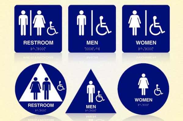
ADA COMPLIANT RESTROOM SIGNS

Blog   Restroom ADA Signs resized 600


New ADA Laws and Regulations

Many businesses don't realize there is a far-reaching and organized series of laws and procedures that govern bathroom signs and handicapped signage. The ADA, the Americans with Disabilities Act, was enacted to give due diligence to making sure that all public spaces, including restrooms and places where industrial signage is needed, are accessible and familiar to the handicapped person.

Recently, the laws regulating ADA restroom signs, and all ADA signs in general, have changed. New legislation has brought all the old ADA signage up to modern codes, and compliance is a must.

ADA signage refers to a lot of different laws and regulations, but some of the ADA restroom signs in particular that have been significantly affected by the new rules are braille signs. Braille signs are one of the most important aspects of restroom signage that ADA regulates, and with good reason. There are dozens of possible pitfalls when it comes to creating a braille sign, not least among them positioning, changes in braille itself, height, and prescribed size and lettering. For a handicapped person, it's absolutely essential that your bathroom signs speak to them in a way that they understand and are familiar with. These new laws make it that much easier to create informative, helpful, safe ADA restroom signs, and to create a braille sign that speaks to the widest possible audience as clearly as it can.

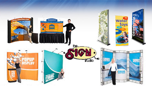
ADA signage is something that's easy to overlook in the rush to get through a job, or to design your interior space in a way that's pleasing to the eye and works with your business, school, hotel, or place of business. However, few things are more important about your ADA restroom sign than the way it speaks to the disabled. The right braille sign, the right ADA sign of any stripe, is designed to keep your business in good standing in two ways. One way is compliance. Without it, your space could be subject to penalties and even lawsuits, and that's never a good thing. The other way is simple customer/occupant care and service. Without the right kind of ADA signage, your handicapped patrons will have a harder time doing what they need to do in your space. Both of those simple, very compelling reasons for updating your signs are focused on here at The Sign Studio. .

Below you'll find a run down of many of the new ADA sign regulations that relate to industrial signage and braille signs. As a service to you and a guideline for how we make our signs in the future, we're placing these ADA regulations on our site - check back to reference them whenever you need. The Sign Studio is your one-stop shop for any kind of braille sign, ADA signage, or any type of state and federal law-compliant sign.

New Regulations Related to Braille Signs

According to the new regulations, when you're writing in braille there are several guidelines in reference to size, height, and font. For example:

"Letters and numerals shall be raised 1/32 in (0.8 mm) minimum, upper case, sans serif or simple serif type and shall be accompanied with Grade 2 Braille. Raised characters shall be at least 5/8 in (16 mm) high, but no higher than 2 in (50 mm). Pictograms shall be accompanied by the equivalent verbal description placed directly below the pictogram. The border dimension of the pictogram shall be 6 in (152 mm) minimum in height."

There are minimums for how far braille must be raised above the surface of your ADA sign, and at The Sign Studio we have the precision machines to get it just right, keep you compliant, and make your signs readable and accessible. We also are completely updated and able to write in perfect Grade 2 Braille, a capability not all sign companies share. We also are well trained and well versed when it comes to all ADA signage symbolics, and all related braille sign explanations and text.

Another set of regulations for braille signs:

Dot diameter: .059 in.
Inter-dot spacing: .090 in.
Horizontal separation between cells: .241 in.
Vertical separation between cells: .395 in.
Raised borders around signs containing raised characters may make them confusing to read unless the border is set far away from the characters. Accessible signage with descriptive materials about public buildings, monuments, and objects of cultural interest may not provide sufficiently detailed and meaningful information. Interpretive guides, audio tape devices, or other methods may be more effective in presenting such information.

As you can see, that kind of minute detailing requires incredible precision. That's why The Sign Studio has invested in the best, sharpest sign creation equipment.  With laser precision, we can make ADA restroom signs to absolute perfect margins and regulations, and every ADA sign we make for your company can be crafted with amazing exactitude.

That's important not only to make your signs compliant, but also to make them readable. For braille users, it's important that braille signs be the same as the braille they read in texts, to cut down on confusion. Confusion that could range from mere frustration to the possibility of danger, neither of which serve you, your place of work, or your guests.

The signs in your space are important on a number of levels, but few of them are more important than respect and customer service. Making the best braille sign possible, in compliance with all ADA signage laws and regulations, is a great way of accomplishing both of those goals, and making them with precision and excellence is a point of pride for The Sign Studio.   There are several other laws regulation ADA restroom signs. They include regulations related to height, spacing, and sign placement.

For instance, all ADA signs intended for use by handicapped persons have to be placed in locations free from any sort of unseen danger, such as the arc of a swinging door, or a protuberance along the wall. A braille sign has to be in a place where the user can feel safe standing still and reading it for any period of time.

"Letters and numbers on signs shall have a width-to-height ratio between 3:5 and 1:1 and a stroke-width-to-height ratio between 1:5 and 1:10."

This regulation ensures that the characters on a given sign will conform to other characters on other signs, making them familiar and readable. This goes for all kinds of ADA signage, and is one more way these ADA regulations make the world of interior space more palatable and easier to navigate for the handicapped.

There is also a regulation mandating that all bathroom signs be high contrast. In other words, if your writing is in a light color, like white, it must be contrasted with a darker background, like blue. You see this combination in a lot of different handicapped signage. The contrast must be 70% to be in full compliance, and the ADA provides a helpful equation to help businesses know how much contrast is enough:

Contrast = [(B1 - B2)/B1] x 100


where B1 = light reflectance value (LRV) of the lighter area and B2 = light reflectance value (LRV) of the darker area. Note that in any application both white and black are never absolute; thus, B1 never equals 100 and B2 is always greater than 0. The greatest readability is usually achieved through the use of light-colored characters or symbols on a dark background.

All of these rules and regulations are essential in crafting the most up-to-date, ADA compliant signs possible. For handicapped persons and those who depend on braille, the new regulations are essential to an improved, more familiar quality of life. The new braille signs that will now be produced are alone worth the effort of bringing your signs up to code. Using literary spacing and Grade 2 braille is an important step in leveling the playing field of industrial signage.

And when it comes to code-compliant, customer service oriented ADA signage, including of course ADA restroom signs, there's no better place to go than The Sign Studio. 

If you have any questions or need further information, please give us a call at (818) 843-9200 or send us an e-mail at thesignstudio@sbcglobal.net  

Topics: ada compliant signs in burbank and los angeles la, ada tactile and braille signs, Restroom Signs, restroom handicap signs

Los Angeles Signs | Traffic Directional Signs

Posted by Julie and Chris Ramirez on Sat, Jan 15, 2011 @ 17:01 PM

TRAFFIC DIRECTIONAL SIGNS

Lead the way with Directional Traffic Signs! Prevent confusion by clearly marking Entrances and Exits to parking lots and facilities. Keep your traffic flowing effortlessly with a well marked lot.

A direction sign, more fully defined as a direction, position, or indication sign is any road sign used primarily to give information about the location of either the driver or possible destinations, and are considered a subset of the informative signs group. Direction signs are far more varied internationally than other classes of sign.

traffic-control-signs-and-signals

Direction signs are the oldest type of road sign. Traffic signs or road signs are signs erected at the side of roads to provide information to road users. With traffic volumes increasing over the last eight decades, many countries have adopted pictorial signs or otherwise simplified and standardized their signs to facilitate international travel where language differences would create barriers, and in general to help enhance traffic safety. Such pictorial signs use symbols (often silhouettes) in place of words and are usually based on international protocols. Such signs were first developed in Europe, and have been adopted by most countries to varying degrees.

The Sign Studio provides street and traffic signs to help keep your roads safe and traffic flowing at a good pace. Traffic signs are a good way to inform drivers of areas that are entrances or exits only, alert them to upcoming speed bumps or closed roads and many other traffic warnings. Made from durable and reflective material, The Sign Studio's traffic signs are the perfect solution to your traffic control needs.
Point people in the right direction with these long lasting and well made signs.

• One Way, Entrance and Delivery signs direct people and let them know where to go.
• Directional Traffic Signs keep your parking lot, mall or road organized.
• Post signs to prevent accidents.

List of most common Traffic Directional Signs

Buckle Up-Seat Belt Signs
Crossing Signs
STOP Signs
Exit Signs
Crosswalk Signs
Do Not Enter Signs
Evacuation Signs
Pedestrian Crossing Signs
Prohibitive Traffic Signs
Reserved Parking
Dead End
No Turn On Red
No Left Turn
No Right Turn
No Turn Around
Do Not Block Intersection
No Thru Traffic
Private Road No Thru Traffic
Not A Thru Street
One Way
Two Way Traffic Ahead
No An Exit
Exit Only Do Not Enter
Slower Traffic Keep Right
Arrow Signs
Wrong Way
Bump Sign
Dip Sign
Dead Zone
Employee Entrance Only
Fasten Seat Belt
No Dumping Under Penalty of Law

We also custom design and make any Traffic Directional Sign you may need, just give us a call at (818) 843-9200 or send us an e-mail with you request at thesignstudio@sbcglobal.net

Topics: One Way Signs, No Parking Signs in Los Angeles and Burbank CA, LA County, Orange County, Stop Signs, Traffic Directional Signs

BURBANK SIGNS | OPEN HOUSE SIGN GUIDELINES

Posted by Julie and Chris Ramirez on Sat, Jan 15, 2011 @ 08:01 AM

OPEN HOUSE SIGN GUIDELINES AND INFORMATION:

Open House Sign

Real estate signs are an integral component of the Realtors business arsenal. They allow the agent to effectively market a property, and they serve as an important directional aide when conducting an open house. With the advent of technology, real estate signs now function in conjunction with many other marketing tools available to the Realtor. However, they retain their status as one of the most important methods of marketing a home.

Unfortunately, real estate signs can become the source of controversy in a community. If residents perceive a preponderance of real estate signs, they will put pressure on local government officials to restrict the display of the signs. Fortunately, state laws exist to protect the rights of real estate practitioners and home owners to market properties via real estate signs. The laws balance these rights with the community’s need to control visual clutter and safety.

CITY OF BURBANK: OPEN HOUSE SIGN GUIDELINES

You must follow the directions contained herein and use common sense.
Signs will be picked up and destroyed if not in compliance:

  1. Size - Total Face area no more than 24 (inches) x 24 (inches).
  2. Height - Vertical distance from ground to highest point not to exceed 3 ft.
  3. Can only advertise a residence in the City of Burbank.
  4. No more than 4 signs per property on public rights-of-way
  5. Must be on stake or A-Frame support.
  6. Signs must be in good condition and of professional signage material.
  7. No balloons or flags can be affixed to the sign, nor any other object that would call attention to it.
  8. Time - Signs shall only be displayed during the “open house”. Saturdays and Sundays (or federal or state holidays) not earlier than 8am and must be removed no later than dusk or 6pm, whichever is earlier. Thursdays, signs may be displayed no earlier than 8am and removed no later than 2pm.
  9. Must have a valid PERMIT as evidenced by valid DECALS on each side of the sign. These permits must be renewed annually.
  10. Identification required. Must have your name, address and telephone number affixed to the sign in an area not to exceed 2”x3” (Business card taped to the sign would be ideal).

It is recommended that you read the entire ordinance for other provisions not set forth on this sheet. Avoid placing signs on the new Chandler Bike path -- it is considered a median. For a full copy of the sign ordinance please contact the Burbank Association of REALTORS at 818/845-7643.

Download your Public Works Department Application/Permit - Temporary Residential Real Estate Open House Signs http://www.burbankrealtors.org/pdfs/openhousesignage.pdf

If you have any further questions or need a professional sign made, please give us a call at THE SIGN STUDIO (818) 843-9200 or e-mail us at thesignstudio@sbcglobal.net 

Topics: CITY OF BURBANK OPEN HOUSE SIGN GUIDELINES, Open House Sign Permits, Burbank Sign Ordinance, Real Estate Permits

LOS ANGELES SIGNS | ALL YOU NEED TO KNOW ABOUT FONTS

Posted by Julie and Chris Ramirez on Fri, Jan 14, 2011 @ 17:01 PM

ALL YOU NEED TO KNOW ABOUT FONTS AND FONT DESIGN

In typography, a typeface is a set of one or more fonts, in one or more sizes, designed with stylistic unity, each comprising a coordinated set of glyphs. A typeface usually comprises an alphabet of letters, numerals, and punctuation marks. 

Font Characteristics resized 600

MY Top 25 Best Fonts Of  2010 - Below you will find the full list of the best and most popular 25 fonts we used last year.

25 Best Fonts resized 600

Have you ever had the problem of not knowing what typeface to use? Well of course you have, everyone has. This is a guide on how to choose a font.

These pointers have been gathered from Robin Williams great book “The Non-Designers Type Book” that I recommended in the top 5 typography resources of all time.

Think about each of these before choosing your next font.

Choose a category of type

Choose a type face that you think will match your work. ie. Oldstyle, Modern, Slab Serif, Sans Serif, Script, Decorative.

Quality of printer & paper

Where are you getting your piece printed? If you are printing from a low resolution printer, your subtle font characteristics such as delicate serifs or fine lines will not get printed. (eg. fax machines, photo copier). Is the paper going to without the ink and quality? eg. Newspapers will absorb ink and lose finer details.

How much text is there to read? What is its purpose?

Are you designing for a sign, billboard, poster, a book, a report? What is more important – readability or aesthetics? What is the purpose of the text? A serious look, a casual look, a decorative look?

How much space do you need to fill? Or leave unfilled?

Different typefaces take up different amounts of space, even at the same point size. Try comparing two fonts next to each other and see how much difference they take up in room.

Is the project to be skimmed or be really read?

Choose a typeface and layout that suits its purpose.

An exercise method for next time you choose a font…

Know your output method and final reproduction process to narrow down your font choices.

Decide on the look you want to convey.

If you use more than one font, make sure the fonts are very different from each   other. If they are not very different it looks like a mistake. eg. Use an oldstyle font for the body text and and a bold sans serif for the headline.

Don’t be afraid to use wild fonts where they are appropriate and use it sparingly. Don’t be a wimp.

How do you go about choosing a font or typeface?   Many people have asked me which text type is best for a magazine, a newspaper, a poster, a newsletter, a publication, etc. In general, I tell them which to use, but I know that this is not the best answer, because they won't learn to do this by themselves.
Today, I want to take time to analyze how to choose correct text typography design in different cases. It is very important to understand that these tips are not final word, but they can be good help at the moment of choosing a text type. In any case, it depends on what do you want to convey with this type, because many times legibility is as important as the character of the type. Try to be very careful and take in account the following points:

Fonts 3 1 resized 600
Fonts 3 2 resized 600

Topics: Fonts, Custom sign design in Burbank CA, custom fonts, most common fonts used

Signs Burbank | Sign Maintenance and HOW IMPORTANT it really is!

Posted by Julie and Chris Ramirez on Mon, Jan 10, 2011 @ 13:01 PM

Sign Maintenance and HOW IMPORTANT it really is!

Signage is the single, largest promotional tool you have. It is your way of saying to the public, "Hey! We're open for business and here to serve." Nice job! You've reminded your current customers that you are here ready to take care of their next need and you've introduced your business to future customers.
But what if your sign is in disrepair? What if the lights in and around your sign are out or the face is broken or dirty. Worse yet, what if it is outdated? Now what kind of impression or message are you communicating? It still reads "Hey - pick me" but it consciously and subconsciously causes your customers to read between the lines . . .

. . . and what they're reading isn't good!

It's saying, "maintenance and upkeep isn't a priority for this business and neither is quality or cleanliness." "If they care so little about their business, how could they possibly care about me, their customer?" What your sign has done is effectively set a negative expectation of your business in the mind of your customer. Your unkept sign defeated the very purpose for which it was intended.

Upkeep and freshening of your signage and lighting shouldn't be an afterthought; it should be a priority . . . protect your marketing investment and allow your signage to do what you intended - work for your business, not against it!

Something else to consider: On average, 46% of first-time customers find your business as a result of your sign. What would a 5 or 10% drop in sales mean to your bottom line simply because your sign was in disrepair or out of date?

Sign Maintenance is another area in which our personnel excel. Our 24/7 service department is on call and ready to serve your sign needs. From storm damage to national maintenance support to routine lamp outages, we have the parts, personnel, and knowledge on hand to make sure your sign maintenance needs are addressed in a timely fashion.

Call to schedule your service project TODAY (818) 843-9200 or send us an e-mail at thesignstudio@sbcglobal.net

Sign Maintenance graphic resized 600

Topics: Sign Maintenance, Sign Repair, Los Angeles Sign Maintenance, Orange County Sign Maintenance, Trouble Shoot Sign Problems

Burbank Signs | Evacuation Maps, Plans and Wayfinding Signs

Posted by Julie and Chris Ramirez on Tue, Jan 4, 2011 @ 10:01 AM

Evacuation Maps & Plans
Building evacuation plans, fire evacuation maps and emergency exit signs are essential to meet fire and building code requirements. The Sign Studio provides custom building evacuation maps and specialty signs. Building evacuation maps are carefully designed to meet all client and fire code requirements. Our exit signs and exit path marking systems are manufactured custom to your liking. Our building evacuation plans, stairtreads and path marking systems provide clear direction to exits and offer vital egress information and indicate the location of fire and safety equipment available.

Fire Evacuation Plans and Evacuation Diagrams
Public and commercial buildings (with 10 or more employees) are required by law to have an emergency action plan. An emergency action plan (EAP) details the actions employees and building occupants must take in the event of a crisis. The fire plan is a component of the EAP which emphasizes in-house fire safety protocols and procedures. The fire evacuation plan must include a schematic of the facility that details egress routes to fire exits, safety equipment locations, post evacuation assembly areas and other pertinent information. As a public safety measure, the authority having jurisdiction (Fire Marshal) requires that evacuation plans be posted for the building occupant.

What Are the Codes and Standards?
Much has been written into fire codes and occupational safety regulations about the necessity of posting fire evacuation diagrams. They are required by law in most facilities. Yet visit any number of buildings with posted fire evacuation signs and you will find as many different sign designs as there are buildings. With the absence of a nationally recognized standard to guide facility managers and sign designers with evacuation map development, we have to ask ourselves whether all building evacuation signs are equally effective? Can diagram size, color, floor plan orientation, text or icon styles affect viewer response during an emergency.

Our expert designers at The Sign Studio will design and prepare your layouts and work closely with you to create effective and proper Evacuation Maps and Signs for your needs. For more information or if you have any questions, please call us (818) 843-9200 or e-mail us at thesignstudio@sbcglobal.net.

Evac Maps resized 600

Topics: Wayfinding Signs, Evacuation Plan, Evac Maps, Evacuation Maps