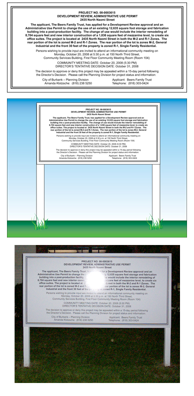
Southern California Sign Blog

Julie and Chris Ramirez

Recent Posts

BURBANK SIGNS | Public Notice Sign Requirements for DR

Posted by Julie and Chris Ramirez on Mon, Jan 3, 2011 @ 13:01 PM

DEVELOPMENT REVIEW
PUBLIC NOTICE SIGN REQUIREMENTS

Unless specifically waived, all applicants for Development Review (DR) are required to post a sign on the project site providing public notice of the pending development application.  This is in addition to the mailing of notices to nearby property owners and tenants.

Requirements for the design, construction and placement of the sign are as detailed below.

  1. The sign is to be erected on the project site at least 10 days prior to the Director’s Decision dated.  The sign is to be removed after the Development Review appeal period has ended.  If the determination is appealed, the sign is to be removed after the appeal has been decided. 
  2. Sign specifications and design:
    1. Size:   8 feet long by 4 feet tall
    2. Height:  Not to exceed 6 feed including support posts
    3. Location:  Not less than 1 foot inside front property line, clearly visible and facing street
    4. The sign must be constructed of plywood or a similar sturdy material.  Paper or cardboard is not acceptable.  The sign must be supported by two posts with a minimum size of 4 inches by 4 inches, with proper footing if required. 
    5. The background of the sign must be white with a border 1 to 4 inches thick.  The border must be black or another dark color that contrasts with the background. 
    6. Lettering must use a font that is readily legible and as large as possible given the amount of text necessary to fit on the sign.  The lettering must be black or another dark color that contrasts with the background.
    7. Sign format is subject to approval b the City Planner.
    8. Sign Copy: as shown below and in graphic.

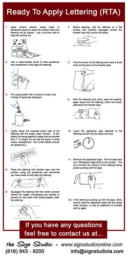
Please see our sample below and if you have any questions or need The Sign Studio to prepare your design/layout and post & panel sign for you, please give us a call at (818) 843-9200 or send us an e-mail at thesignstudio@sbcglobal.net.

P & P resized 600


Topics: Burbank CA Sign Requirements, Public Notice, Development Review Signage

Signs Burbank | Sign Buyer's Questionnaire

Posted by Julie and Chris Ramirez on Thu, Dec 30, 2010 @ 19:12 PM

Sign Buyer's Checklist

Here's a quick questionnaire to help identify your signage needs and guide your SIGN STUDIO  consultant in making good recommendations for your project.

??  Use of your sign:
Are you directing, informing, or selling?

??  Image you want to project:
Professional? Sophisticated? Youthful? Fun? How should it coordinate with your other graphics and advertising?

 ??  Your target customers:
Whose attention do you want to attract?

??  Viewing distance and time:
How far will readers be from the sign? How long will they have to read it? 

??  Mounting your sign:
Where will the sign be displayed? How will it be attached? Will you need the approval of a landlord or local sign code authority?

??  Display time and conditions:
Temporary or permanent? Indoors or outdoors?
 

Sign copy and layout: What message do you want to communicate in your copy? Do you have special logo or layout requirements?

For further information or questions, please give us a call at (818) 843-9200 or send us an e-mail at thesignstudio@sbcglobal.net

Topics: burbank ca signs, signage los angeles ca, los angeles ca dimensional letters, pasadena ca dimensional signs, signs burbank ca, signs la, sign company los angeles, sign company burbank, sign company pasadena, sign company glendale, sign company west hollywood

Signs Burbank | Banner Finishing Options

Posted by Julie and Chris Ramirez on Wed, Dec 29, 2010 @ 07:12 AM

TYPICAL BANNER FINISHING OPTIONS - What will work for you?

GROMMETS:
Provide a convenient method for attaching the banner at regular points. This distributes the banner's weight and helps to keep the banner from sagging. Grommets are the most common method to hang banners.

HEMMED EDGES:
Hemmed edges are typically used to reinforce the sides of vinyl banners, helping maintain the banner's shape and prevent stretching.

POLE POCKETS:
Pole pockets allow for rigid poles to be inserted along the edges of the banner. This allows for a more even distribution of the banner's weight to prevent sagging. Opposing pole pockets can also be used to make the banner more rigid.

POWER TAPE:
Power tape reinforces the edges of shear cut banners or banners that have no material available for hemmed edges.

BANNER-UPS:
A plastic tab with eyelet attached to each corner of the banner. This creates convenient attachment points to have a banner.

D-RINGS WITH NYLON WEBBING:
D-Rings with nylon webbing are typically sewn into large banners that will hang on buildings. The D-rings allow the banner to be secured with ratchet straps.

NYLON WEBBING:
Webbing sewn into the top and bottom makes the banner stronger and significantly extends banner life. Webbing is typically used in areas subjected to higher wind loads.

If you have any questions, please give us a call at (818) 843-9200 or e-mail us at thesignstudio@sbcglobal.net.

Banner Finishing Options resized 600

Topics: Banner Installation, banner finishing options, grommets, banner-ups, pole pockets, nylon webbing, banner D-Rings, Banners

Signs Burbank | Dimensional Signs and Letters

Posted by Julie and Chris Ramirez on Tue, Dec 28, 2010 @ 07:12 AM

DIMENSIONAL LETTERS FOR YOU -

          Dimensional Letters and Logos provide a sophisticated, professional, and distinctive image.  Whether you're creating a simple sign on top of your headquarters or an intricate lobby display, your message deserves to stand out.  A great way to enhance the appeal of your business instantly.  Made with acrylic, wood, aluminum, PVC or a variety of sign foam to ensure of durability.  For further information or questions, please send us an e-mail at info@signstudiola.com or give us a call (818) 843-9200.  

 Dimensional Letters @ The Sign Studio, Burbank, CA

Topics: metal letters, dimensional signs, foam letters cut out letters, dimensional letters

Burbank Signs | Ready to Apply Vinyl Lettering Signs

Posted by Julie and Chris Ramirez on Mon, Dec 27, 2010 @ 07:12 AM

READY TO APPLY LETTERING – also known as RTA Lettering. 

If you are looking to save yourself some money and are confident in your application abilities, the following directions on how to apply your own vinyl lettering will help you to install your own signage. 

  1. Apply window cleaner, soapy water, or denatured alcohol to clean the surface where the lettering will be placed.  Use a lint-free cloth to wipe the surface dry. 
  2. Use a water-soluble pencil to draw guidelines and centerlines to help align the lettering. 
  3. Fill a spray bottle with a mixture of water and 3 drops of liquid dish detergent.
  4. Before applying, rest the lettering on a flat surface and carefully squeegee across the transfer tape that covers the bottom.
  5. Find the center of the lettering and make a small mark at that point on the transfer tape. 
  6. With the lettering face down, peel the backing paper away from the lettering, which will remain adhered to the transfer tape.
  7. Lightly spray the exposed sticky side of the lettering with the soapy water solution (if the letters are being applied to glass and are smaller than 1” in height, do not use the spray, it could cause misalignment.)  Small letters should be applied dry. 
  8. Place the lettering and transfer tape onto the surface, using any guidelines and centerlines you have made to help align the lettering.
  9. Squeegee the lettering from the center outward toward the edges, overlapping your strokes to prevent air and water from being trapped under the lettering.
  10. Leave the application tape attached to the lettering and let it dry for about one hour. 
  11. Remove the application tape.   Put the tape back at a 180-degree angle (flat) to the surface.  This will minimize the chance of the lettering being pulled up along with the tape. 

If you have any questions of need help with your Installation, please give us a call at (818) 843-9200 or e-mail us at thesignstudio@sbcglobal.net

 The Sign Studio, Burbank CA, RTA signs, vinyl graphics, vinyl application, vinyl signage

Topics: ready to apply vinyl letters, vinyl lettering, RTA lettering and vinyl, vinyl signs, vinyl decals

Burbank Signs | Channel Letter Glossary

Posted by Julie and Chris Ramirez on Mon, Dec 27, 2010 @ 07:12 AM

Channel Letter Glossary - Need a quick channel letter term definition? Here are a few common ones:

Acrylic: Translucent plastic used as a channel letter face material. Acrylic is available in a wide of colors, and its thickness is typically 1/8" or 3/16".

Channel Back: Aluminum that is routed in the shape of a letter to form its backing.

Cut-off switch: Electrical switch placed on the outside of the building, usually above, below or on a channel letter signs raceway.

Drain holes: Small holes placed at the bottom of a channel letter. Drain holes permit rain and condensation to drain out of a letter's interior.

Electrode: The terminal at the end of a neon tube that connects to a GTO wire. Neon tube fabricators attach electrodes to glass tubes by melting the glass to form an airtight weld.

GTO cable: Insulated electrical wire designed for high-voltage current. GTO cables connect neon tubes.

Electrode boot: A rubber boot designed to be installed on the double back or electrode of a neon tube to protect against electrical shocks or arcing.

LED: An electronic light source for channel letters. LED stands for Light Emitting Diode, and this type of lighting is illuminated by the movement of electrons in a semiconductor material. LED Channel letters are becoming more and more popular.

Neon: Another illumination option for channel letters, neon is a luminous glass tube filled with inert gas. High voltage electricity from a transformer excites the gas to produce light. Tubes may be bent to form various shapes and letters.

Permit: A legal document required by a municipal building department that allows the installation of a specific sign at a designated location. It is illegal to erect a new sign without first obtaining the appropriate permit.

Polycarbonate back: A protective plastic insert cut to the same shape as a reverse channel letter and attached to seal the letter's back. This prevents rainwater entry and also keeps animals from nesting inside the letter. Polycarbonate backs also provide mounting surfaces for neon tube supports.

Raceway: An enclosed aluminum channel (typically 8" by 8") that spans the entire length of the letters. Channel letters are pre-installed on the raceway in the shop, thus simplifying installation in the field.

Return: The side of a channel letter. Returns are commonly constructed of aluminum, and are typically 5" deep.

Tie wire: Thin copper wire that attaches a neon tube to a tube support.

Transformer: A channel letter's high-voltage power supply. Transformers are available in various current outputs, typically ranging from 7500V to 15,000V.

Trim cap: The flexible plastic edging that surrounds a channel letter's face. Trim caps are chemically welded to the face, and are available in a variety of colors.

Tube support: A glass standoff that typically is fastened to a channel letter back to hold neon tubing in place.

UL-approved: Underwriter's Laboratories (UL) is an independent product safety certification organization. UL approval means that all sign components meet UL standards for electrical safety.

If you have any questions, please give us a call at (818) 843-9200 or send us an e-mail at thesignstudio@sbcglobal.net

IMG resized 600

Topics: Channel Letters, burbank ca signs, Channel Letter Signs, Illuminated Channel Letters, ul approved, trim cap, transformer, sign raceway

Burbank Signs | Trade Show Graphics Checklist

Posted by Julie and Chris Ramirez on Sun, Dec 26, 2010 @ 07:12 AM

Trade Show Graphics Checklist:

Your Sign Studio consultant knows all the tricks of the trade show.

We'll help you:

 - Create a striking design that communicates a clear message and business image.

 - Distill your product information into easy-to-read, bullet-pointed copy.

 - Choose the right color scheme that complements your logo and shows off your products.

 - Select a booth and graphic materials that are durable and lightweight for easy, affordable transport and storage.  

 - Strategically position graphics to guide traffic flow in and out of your booth space.

 - Keep your trade show booth on budget while also achieving a highly effective, professional look.

The Sign Studio has everything you need to create a powerful trade show exhibition.

Contact us at (818) 843-9200 or send us an e-mail at info@signstudiola.com for assistance.

Topics: tradeshow signs, graphics for tradeshow, sign graphics for tradeshow

Signs Burbank | Effective signs for you and your business.

Posted by Julie and Chris Ramirez on Sat, Dec 25, 2010 @ 07:12 AM

Signs and graphics serve three general purposes: to inform, direct and sell. The initial impression a person has about a business is often the result of their signs and graphics. By employing effective signs and graphics, businesses of all types and sizes can make the most of that first impression.

Signs are valuable to businesses of all sizes, and in all industries. Signs help consumers become aware of a business, service or event, can help prompt purchases, change purchase decisions and build brand equity.

Signage is an inexpensive, yet very effective form of advertising. During a slow economy, advertising is crucial and it helps create a long-term competitive advantage. Maintaining an advertising presence through signs helps build long-term brand awareness.

Effective signage can also be a determining factor in influencing customers to switch from a weaker brand. What can effective signs and graphics do for you?

Contact The Sign Studio @ (818) 843-9200 or send us an e-mail - info@signstudiola.com.

Topics: Effective Signs, sign advice, Sign Design, sign advertising

Signs Burbank | Sign Color Chart - colors have personality

Posted by Julie and Chris Ramirez on Fri, Dec 24, 2010 @ 07:12 AM

Different colors and fonts appeal to different personalities, and if you really want signs that attract, you'll make an effort to understand to whom what color goes with your personality. Here are the most common examples and top 3 colors used:

The Sign Studio in Burbank CA - Sign Color Chart

Red:  Red is exciting and active - it suggests boldness and efficiency, and is appetite-inspiring, hence McDonald's use of red (as well as yellows and oranges).  As you can see, red especially appeals to "Emulators," or people who are sales-oriented and talkative.  Red implies urgency.

Blue:  Blue is the most widely used color in appealing to businesspeople and entrepreneurs called "Achievers."  Blue is serene, suggesting wisdom, dignity, and stability, hence the wide use of blue by banks.  Men prefer blue to red and are supposed to prefer blue to red because it is more restful to the eye.  Blue is businesslike. 

Green:  Green and other earth-tone colors appeal to the vast group called "Belongers."  These people are the "middle America" people - usually employees, family people, and definitely relationship-oriented.  They enjoy green, browns and golds.  Earth-tones are friendly. 

If you are interested in more color analysis or color combinations, please give us a call at (818) 843-9200 or send us an e-mail at info@signstudiola.com


Topics: sign color chart, sign planning, sign colors, Sign Design

Signs Burbank | Architectural Signage

Posted by Julie and Chris Ramirez on Thu, Dec 23, 2010 @ 07:12 AM

ARCHITECTURAL SIGNAGE- does more than communicates a message. Architectural signage must also help build the brand name of the company it serves. Success depends not only on precision craftsmanship but also on cutting edge design and carefully selected materials that will best represent the finished product.

Planning for Precision and Durability

Architectural signs

Creating quality architectural signage means understanding the details and planning for the obstacles involved. The challenges are somewhat different depending on whether you are creating signage for indoor or outdoor use.The challenge on indoor signage is to have a degree of precision that is unsurpassed. With exterior signage the tolerances do not have to be quite as precise, but there are other challenges that are just as significant, such as weather conditions and environment. Interior signs are in air conditioned environments but with exterior items we have to worry about sunlight, humidity, heat, cold and so on.

Understanding How Lighting Impacts Display
Fade resistant materials are important to protect both indoor and outdoor architectural signage from the sun and understanding the impact of ambient lighting is also a key challenge.

Choosing the Right Materials for the Job
Between durability and lighting concerns, choosing the right materials for architectural signage can be a major obstacle for the novice. Avoid lower end plastic products, they look cheap.

Special Considerations in the Design Phase
The actual "look" of a sign is the focus of most everyone's attention. The primary challenges in the design phase is coming up with a look that the everyone wants and choosing materials while staying within budgets. It is important to choose materials in the design phase so that you can prepare for any special requirements, such as lighting, mounting, or curved walls.

For further Information or if you have any questions, please call The Sign Studio @ (818) 843-9200 or send an e-mail to thesignstudio@sbcglobal.net.


Topics: Architectural Signs, design signs, sign plans, burbank ca signs, los angeles ca signs