Southern California Sign Blog

Burbank Sign & Banner Company | Design Signs & Banners That Work!

Posted by Julie and Chris Ramirez on Tue, Oct 30, 2012 @ 06:10 AM

HOW TO CREATE SIGN BANNERS that catch your ATTENTION!

Here are some statistics about basic color combinations, font styles, margins and graphics usage in successful banners.
Since the primary goal of a banner is to grab the viewer's attention and then communicate a message, the banner should be readable and visually attractive. The following steps are a good place to start to create an appealing and attractive banner, and to maximize its effectiveness.

1. Choose appropriate font styles.
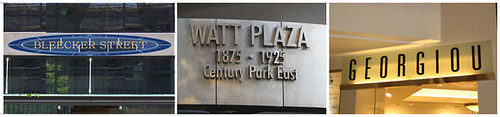
Avoid using more than two type styles on a banner. The more fonts used, the harder it is to read. Sans serif fonts like Helvetica, Futura and Antique Olive are the easiest to view from a distance. They should be used for the primary message on your banner. Likewise, serif fonts such as Goudy, Benguiat or Times are appropriate for a secondary message. Fonts such as Old English Text or Engraved are almost impossible to read correctly from a distance and should only be used when the viewer is stationary for a period of time (such as in a conference hall, meeting room or retail store) to be able to absorb the entire message at their own pace.

Take into account the type of business or event where the banner will be used. A bridal shop or beauty salon banner can be dressed up with a script font such as Brush or Commercial Script; however, these fonts would be out of place in an auto parts business.

Also, try to stay away from using all upper case lettering on your banner. It can be used for one word or a line of text for emphasis, however, it takes the human eye longer to read and process words in upper case.

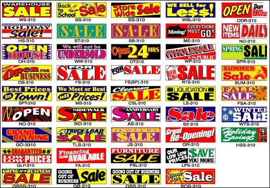
2. Use Graphics Appropriately
Logos, clip art, borders, etc. can effectively be used to grab the viewer's attention, but should not overpower the sign's main message. If the viewer is only concentrating on the cool clip art or graphic, the message has been lost.

As a signage professional, we have already developed an eye for what works and what doesn't so if you need our help or have any questions, please give us a call. As you drive around your community, look around at all the banners grabbing for your attention. Notice the ones that stand out. Mentally take a note about one or two elements of the banner design that grabbed your attention in the first place.

3. Consider viewing distance and viewing time.
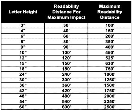
"How far away will the banner be from the viewer?" If a grand opening banner will be on the front of a business with a large parking lot between the storefront and the street, the letter height must be large enough to be viewed by drivers on the street. Also, keep in mind that a driver only has about 1.5 - 3 seconds to read a message while in motion. The chart below will help determine the correct height vs. viewing distance.

Banner Distance Chart

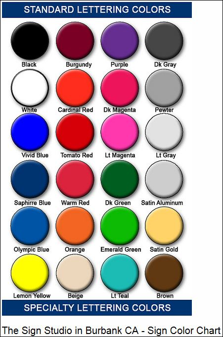
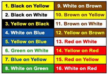
4. Use effective color combinations.
The following chart shows the most readable and successful color combinations in order of viewing effectiveness. Color combinations with high contrast between the background and letters are easier to read and can be viewed from greater distances. Always consider the type of business or event when choosing colors. Pink, purple, teal and orange colors aren't shown on this chart, but still can be used for certain holidays, special events or parties.

Banner Color Chart

5. Banners need margins and white space.
Margin widths are usually the most abused spaces on a banner. Common errors include stretching letters and graphics to fill the entire banner to the edges, or the text and graphic is too small for the sign and the margins are too big. A general rule of thumb is to have the top and bottom margin be 10% of the height, and right and left margins be at least as wide as one of the banner's main font character width. For example, a 48" sign should have a 4.8" top and bottom margin. A three-foot wide banner should have at least a 3" margin on the top and bottom. Avoid filling the empty spaces of the banner with graphics. White space helps keep the viewer's eyes concentrated on the text.

Although these are good general guidelines, they might not always produce desired visual results. Use your own discretion and intuition. Creating attractive and effective signage is essential.

If you have any further questions or need The Sign Studio to design your banner or signage, please give us a call at (818) 843-9200 or send us an e-mail at info@signstudiola.com.

Need Quote

Sign Banner Images

Topics: design signs, Design Banners, Burbank Sign & Banner Company

What Are the Most Common Sign Colors for Sign Design?

Posted by Julie and Chris Ramirez on Tue, Feb 28, 2012 @ 06:02 AM

What Are the Most Common Sign Colors for Sign Design?

Did you know.......different colors and fonts appeal to different personalities, and if you really want signs that attract, you'll make an effort to understand to whom what color goes with your personality. Here are the most common examples and top 3 colors used:

Red: Red is exciting and active - it suggests boldness and efficiency, and is appetite-inspiring, hence McDonald's use of red (as well as yellows and oranges). As you can see, red especially appeals to "Emulators," or people who are sales-oriented and talkative. Red implies urgency.

Blue: Blue is the most widely used color in appealing to businesspeople and entrepreneurs called "Achievers." Blue is serene, suggesting wisdom, dignity, and stability, hence the wide use of blue by banks. Men prefer blue to red and are supposed to prefer blue to red because it is more restful to the eye. Blue is businesslike.

Green: Green and other earth-tone colors appeal to the vast group called "Belongers." These people are the "middle America" people - usually employees, family people, and definitely relationship-oriented. They enjoy green, browns and golds. Earth-tones are friendly.

If you have any questions or need further information, please give us a call at (818) 843-9200 or visit our website at www.signstudiola.com – You can also reach us by e-mail at info@signstudiola.com

NEED QUOTE

Sign Color Chart

Topics: design signs, sign color chart, Standard Sign Lettering Colors

Signs Los Angeles | How to pick the perfect Font for your Sign?

Posted by Julie and Chris Ramirez on Sun, Sep 11, 2011 @ 06:09 AM

"What is the perfect font for your sign?"

Since you asked there is really no answer to this question. It's a question we get a lot at The Sign Studio. Truly a question like that has to be answered on a case by case basis. It's like asking what is the perfect color for the outside of my house? The simple answer is white walls and black trim and shutters. There are no simple answers in life. Can you imagine driving through a neighborhood where all of the houses were decorated with white walls and black trim and shutters? Creepy right?

Now imagine that only one of those houses in that neighborhood was painted a nice tan with beige trim and a red door. That house would really stand out next to all the other houses. That's what you are looking for in a font a way to stand out amongst all the other black and white houses.

More importantly you need to find a way to stand out and get your message across concisely and as quick as possible about who you are and what you do. You only have the viewers attention for a very small amount of time before the next shiny thing grabs their attention. Here are two things that I think help when trying to consider what font to use.

What am I trying to say? Who am I trying to reach?

Say you run a bridal company. You are going to want a font that will reflect what it is you do and with its look you want it to give your name a look that will reach people. In this case it will have to have a gentle sophisticated feel to it. It's a bridal company and not a plumbing company after all. Those are two different looks. See below...

Fonts
 
Which looks better? See the difference? It's something to think about...

If you have any questions or need further assistance with anything, please give us a call at The Sign Studio (818) 843-9200 or send us an e-mail at infor@signstudiola.com

NEED QUOTE

Topics: sign fonts, design signs, Custom Sign Design

Signs Burbank | Architectural Signage

Posted by Julie and Chris Ramirez on Thu, Dec 23, 2010 @ 07:12 AM

ARCHITECTURAL SIGNAGE- does more than communicates a message. Architectural signage must also help build the brand name of the company it serves. Success depends not only on precision craftsmanship but also on cutting edge design and carefully selected materials that will best represent the finished product.

Planning for Precision and Durability

Architectural signs

Creating quality architectural signage means understanding the details and planning for the obstacles involved. The challenges are somewhat different depending on whether you are creating signage for indoor or outdoor use.The challenge on indoor signage is to have a degree of precision that is unsurpassed. With exterior signage the tolerances do not have to be quite as precise, but there are other challenges that are just as significant, such as weather conditions and environment. Interior signs are in air conditioned environments but with exterior items we have to worry about sunlight, humidity, heat, cold and so on.

Understanding How Lighting Impacts Display
Fade resistant materials are important to protect both indoor and outdoor architectural signage from the sun and understanding the impact of ambient lighting is also a key challenge.

Choosing the Right Materials for the Job
Between durability and lighting concerns, choosing the right materials for architectural signage can be a major obstacle for the novice. Avoid lower end plastic products, they look cheap.

Special Considerations in the Design Phase
The actual "look" of a sign is the focus of most everyone's attention. The primary challenges in the design phase is coming up with a look that the everyone wants and choosing materials while staying within budgets. It is important to choose materials in the design phase so that you can prepare for any special requirements, such as lighting, mounting, or curved walls.

For further Information or if you have any questions, please call The Sign Studio @ (818) 843-9200 or send an e-mail to thesignstudio@sbcglobal.net.


Topics: Architectural Signs, design signs, sign plans, burbank ca signs, los angeles ca signs