Pasadena & Glendale Sign Co. | Interested in the history of Sign Fonts?
History of Popular Fonts Used for Signs
“What’s the best font to use on a sign?”
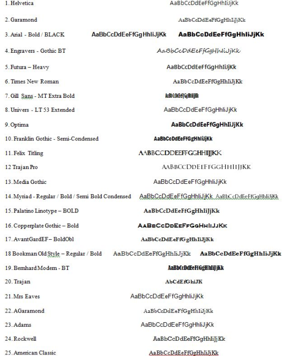
It’s a question that The Sign Studio team members face frequently. While there is no one perfect answer for every situation, there are some fonts that have endured through the years to become staples in visual communications, DIN 1451, Frutiger, Gill Sans and Helvetica are classic fonts that have helped countless people reach their destinations throughout the decades.
DIN 1451 isn’t a promising name for a good communicator, but it has been used since the 1930s for scientific and traffic signs. The name is an acronym for the German Deutsches Institut für Normung (German Institute for Standardization). In 1936 the German Standard Committee named DIN 1451 the official typeface for technology, administration, engineering, traffic and business. The medium version of this font was popular with graphic designers in the 1980’s and today it is frequently used for identification on vehicles and as cast metal lettering for street and building signage.
Frutiger is a typeface commissioned in 1968 by the Charles De Gaulle International Airport for new directional signs. Type designer Adrian Frutiger was told to create a modern font that had excellent visibility at various angles, sizes and distances. This highly legible font with a warm personality is a favorite in the advertising industry. In 2008 it was the fifth best-selling typeface of the Linotype foundry. It is used throughout the public transit network in Norway since the 1980s.
In 1929 Eric Gill was commissioned to produce Gill Sans for the London and North Eastern Railway (LNER). It was first presented in a single uppercase weight and became very popular immediately. It was the standard typeface for all LNER posters, locomotive nameplates, station signage and even the menu on the dining cars. More recently, the BBC adopted Gill Sans for its corporate typeface in 1997. The British Government formally adopted Gill Sans as its standard typeface for use in all communications and logos in 2003.
Helvetica is another classic font, so popular it even inspired its own film. The U.S. Government uses Helvetica for everything from federal tax forms to NASA’s Space Shuttle orbiter. It is also used for the U.S. television rating system. Helvetica was adopted as the official font for all of New York City’s Metropolitan Transportation Authority in 1989. The Chicago Transit Authority uses Helvetica for the city’s elevated train system and Philadelphia’s SEPTA uses it exclusively for all signage.
To learn more about the history of classic fonts, visit this excellent post from the Live Well Collaborative.
If you have any questions or need assistance with anything, please give us a call at The Sign Studio (818) 843-9200 or send us an e-mail at info@signstudiola.com.


