Los Angeles Sign Company | The Best Sign & Banner Design Fonts
Arial Black
Arial Black is one of the most common fonts to use on a banner.
It’s plain, basic block lettering, and it’s very easy to read. If you have a
lot of words or letters to fit on a small banner, it might not work as well as…
Impact
Impact. This is a very bold block lettering font, but it is much narrower
left to right than Arial Black. It’s still one of the best fonts for banners,
but it lets you squeeze a little more information onto your banner. (See how we
were able to include the area code, even at the same font size as the Arial
Black banner?)
Cooper Black
Cooper Black is a good compromise between friendly and professional, so it
works well for a small business banner font. It’s got very big bold letters
like Arial Black, but it’s more rounded. Not everyone likes the way the numbers
are offset, though.
Arial
Arial and Times New Roman are good if you have several lines of less
important text on your banner. Try to use a bolder banner font for your
headline, then use these fonts for the less-important details. As you can see
here, Arial is a little narrow to use for headline text.
Save Times New Roman for longer paragraphs. If you are including bullets or short
phrases on your banner, Arial is usually a little easier to read because of its clean appearance.
Cancun is another very big, bold font that’s good for banner headlines. It
only allows you to type in uppercase, so reserve it for short words or phrases.
It has a tropical beachy feel that’s good for celebrations or sale banners.
Last but not least, Stencil is a great font for bold headlines. It gives a
very strong, military feel to a banner and has all capital letters like Cancun.

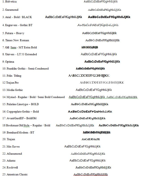
Worst fonts for banners
Some fonts look great on stationery, but they just don’t work for larger formats.
Here are some of the top fonts to avoid when designing a banner: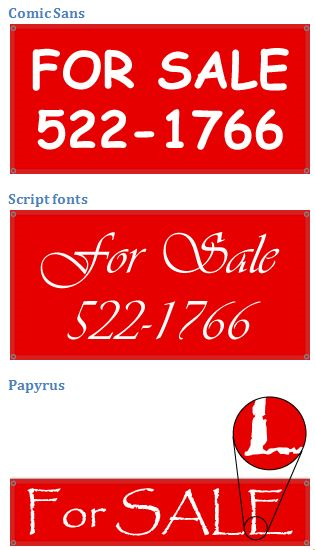
If you have any questions or need assistance with anything, please give us a call at The
Sign Studio (818) 843-9200 or send us an e-mail at info@signstudiola.com. From Concept to
Finish The Sign Studio is here for you – On time and on budget!
Vinyl Banner Adhesive Vinyl Indoor Stands
Banner Blockout Adhesive Clear / Translucent Outdoor Stands
Banner Backlit Adhesive Window Perf Lightbox
Mesh / Smooth Vehicle Graphics /Wall Graphics Sidewalk Signs
Window Static Cling Floor Graphics
Premium Vinyls Signicades
Paper Posters Reflective Vinyls Plasticades
Scrim Banner Metallics /Gold / Silver Retractable
Printable Fabrics Chalk Vinyls Post & Panel Signs
Photo Paper Valet Parking Signs
Overlaminates Simpo Sign Frames
Pedistal Signs
Wind Spinners
Real Estate Frames
Trade Show Displays
RIGID SIGNS
Foamcore
Coroplast
PVC Board
OTHER SIGNS
ADA Signs - Restroom / Handicap
Parking Signs
Regulatory Signs
Construction Signs
Acrylic Displays
Golf Signs
Commercial Signs
Dimensional Letters
Digital Imaging Signs
Electrical Signs
GEMINI Products
Vista Systems
Signicade/Plasticade Distributor
The Sign Studio also provides maintenance and service calls
on all signs. We proved service to the
following areas:
Los Angeles, West Hollywood, Hollywood, Studio City, Century
City, Santa Monica, Culver City, Burbank, Pasadena, Glendale, Tarzana, Woodland
Hills, Anaheim, Arcadia, Alhambra, City of Duarte, West Covina, El Monte,
Toluca Lake, Universal City, La Crescenta, Whittier, Buena Park, San Fernando,
La Canada, Cerritos, City of Lakewood, Glendora, Compton, Long Beach, San Fernando, Sylmar