The age makeup of the United States population is experiencing a major shift. Americans are living longer than ever before with new technologies and improved healthcare. In fact, twenty percent of our nation’s citizens will be over the age of 64 by 2030 according to the U.S. Census Bureau. To reflect the needs of our older population, marketers would be wise to begin tailoring digital and printed signage to this demographic. You can make certain that important content is being effectively and carefully communicated by enhancing visual messages.
Older Adults Have Specific Visual Needs
The ability for light to reach the eye is reduced by as much as 75 percent by the time people reach the age of 60. This leads to colors appearing less distinct and dimmer. For more strategic signage, marketing geared toward seniors should consider this and other health factors.
When advertising to older adults, changes like less visual clutter, larger fonts for signs, typefaces for poor eyesight, color combinations for simplified reading, and low glare, high contrast designs can make all the difference. To best serve an aging population, we will show you how to create signs that cater to older customers in Los Angeles in the sections below.
Typefaces for Poor Eyesight
 Consider sans serif typefaces for your signage fonts. These are the most readable for people with poor eyesight, since they have consistent stroke widths and larger heights. In addition, sign fonts should contrast clearly against the background and be bold. For typefaces in signage systems, both width and height ratio guidelines are set out in the Americans with Disabilities Act (ADA). This is why you need ADA signs for older customers in Los Angeles.
When selecting a font for aging eyes, consider including the following text properties:
- More distinct forms for each character, such as the tails you see on j and t
- Consistent stroke widths
- For certain letterforms, extended horizontal strokes, including the crossbar on the letter t
- Wider horizontal proportions
- Open counterforms
Color Combinations for Simplified Reading
Designers should consider the effects of colors on both mood and vision when creating signage for seniors. Colors appear grayer as people age, since the lens of the eye becomes more yellow and hardens. This makes it hard for them to distinguish green from yellow and  purple from blue. It is more difficult to perceive color contrasts, so using a color wheel will aid in finding the high contrast combinations.
Keep It Simple
People over the age of 65 will have a harder time of comprehending or even seeing advertisements with a lot of words. You will be much more effective in communicating to seniors with a simpler sign. For text, use plain backgrounds. And, since pictures are viewed more easily and quickly than copy, consider using graphics in the place of words.
At The Sign Studio, we have extensive experience making ADA signs and signs that cater to older adults. Contact us today for a free consultation on how we can make your business friendlier to seniors.

 Many building and business owners come to us with questions like “Should I install ADA signs for my business in Los Angeles?” Or, “How do I know if I need ADA signs in Los Angeles?” The ADA website has the answers to both of these questions as well as more information about ADA compliance. However, below is what we generally tell business owners.
 There are also a lot of reasons behind the necessity for ADA complaint signs. First of all, businesses open themselves up to both lawsuits and complaints when they do not comply with the
  of facilities. Among these establishments are religious entities and the facilities they run, railroads, and private clubs that do not open their doors to the general public.
 With the passage of the Americans with Disabilities Act (ADA), it became illegal to discriminate against those individuals with disabilities. The ADA requires altered or newly constructed local or state government facilities, places of public accommodation, and commercial facilities to be usable by and readily accessible to people with disabilities. Part of these requirements is having the right ADA signs for recreation facilities.
 Wading pools, spas, and swimming pools
 In addition to the above requirements, the signs must be made a certain way to ensure that everyone can read them. Some of the laws for signage include:
 Few people realize that they can get custom metal plaques from a commercial sign company. Yet, The Sign Studio has been offering Gemini metal plaques for many years now. These plaques are what we use when businesses come to us for long lasting metal plaques for ADA signs in CA. What are the benefits to using Gemini metal plaques for your ADA signs? This blog will answer this question and more.
 When the Americans with Disabilities Act (ADA) became law in 1993, business owners had a lot of questions about compliance. Whether you are requesting custom designed pieces that seamlessly blend into your office or if you are just ordering standard plaques, our design team in conjunction with the quality control and manufacturing standards at Gemini will make certain that your ADA markers and signage are in compliance. Your imagination is the only limiting factor when choosing the design, shape, and color of your ADA plaques.
 To deliver a plaque that is completely customized for your application, we combine our full color, high resolution printing
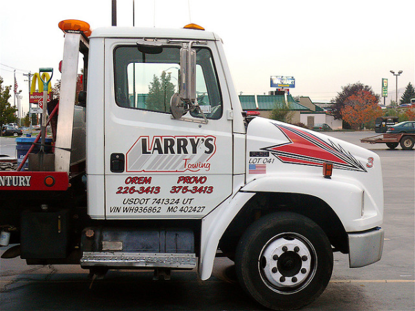
 In order for you to operate your vehicle legally, United States Department of Transportation (DOT) numbers may be required if you move cargo or people across state lines or drive a commercial vehicle. You must register with the Federal Motor Carrier Safety Administration (FMCSA) to get your USDOT number. This must then be displayed on your vehicle.