Banner Installation Methods
Want to save money and install your own banner? If so, here are some typical banner installation methods. Banners are generally installed using one of these four methods.
Banner Installation Methods
Want to save money and install your own banner? If so, here are some typical banner installation methods. Banners are generally installed using one of these four methods.
Topics: Banner Installation, banners los angeles ca, banners la
Sign Lettering Font Tips
Use simple block fonts when creating signs that need to be readable from a distance. A more stylish font may be harder to read and required to be set at a larger size. You should never set a script or cursive font in all capitals, the results will be very hard to read. Avoid using a heavy or fancy headline font for large passages of text. Use fancy lettering where type needs to draw attention to itself, such as a logo or a headline. Use more conservative looking type where items need to be subdued or merely listed, such as large areas of text, sub-headlines and items in a list.
If you need further assistance, please call The Sign Studio (818) 843-9200 or e-mail us at thesignstudio@sbcglobal.net
Topics: sign fonts, sign lettering
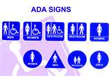
The ADA Tactile & Braille Signage Code is a wide-ranging civil rights law that prohibits, under certain circumstances, discrimination based on disability. The lack of accessibility or certain services can be considered discrimination, regardless of who it actually affects. This creates a need for ADA compliant signs. No individual may be discriminated against on the basis of disability with regards to the full and equal enjoyment of the goods, services, facilities, or accommodations. When the law was first put into effect, there was a problem with ADA signs not being esthetically pleasing. Now that it's been in existence for some time, the question of esthetics has been resolved and the industry faces new problems with ADA signs. We continually add articles to this section, so be sure to check back often.
ADA Guidelines
Letters can't be smaller than 5/8-inch or larger than 2 inches. All letters must be a minimum 3/32 inches thick for tactility. And, generally, you cannot use elaborate or decorative fonts. San Serif fonts, like Helvetica, are the staple of most ADA signs. It may sound restrictive, and it is at some level, but the goal is not to stifle creativity. The goal is to serve an intended audience.
While ADA guidelines define font size, contrast and other criteria, the law does not define specific design criteria as it relates to aesthetics. Letter height, Braille placement, font, and color contrast make only minimal impacts on the visual appearance. There are ways to make ADA signage more attractive while still adhering to the guidelines.
ADA Materials
ADA-compliant materials are one way to make the difference between a ho-hum sign and an attractive presentation. Sign frames with the ability to change printed inserts are another. Finally, understanding what the guidelines really say about color contrast and icons could give you more freedom than you thought. Signs can be designed and made from an amazing variety of materials ranging from basic plastics to very elaborate designs of natural stone, woods, or metals.
For further information or questions, please call The Sign Studio (818) 843-9200 or e-mail us at thesignstudio@sbcglobal.net
Topics: ada signs; ada tactile and braille signs, ada compliant, ada sign materials
SOLID METAL LETTERS - How beautiful and elegant they really are!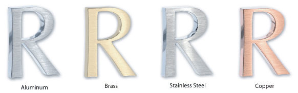
STAINLESS STEEL LETTERS
- Satin Grained Face or Polished – you just can’t go wrong with the look, absolutely gorgeous! Available sizes from 1” - 48” with thicknesses that range from 1/8” – ½” / Waterjet Flat Cut from solid 304 Alloy.
ALUMINUM LETTERS
- Satin Grained Face or Polished – Great pricing! Great look for economical prices. Available sizes from 1” – 48” with thicknesses that range from 1/8” – ½” / Waterjet Flat Cut from Solid 5052 Alloy.
BRASS LETTERS
- Satin Grained Face, Oxidized or Polished – Very Classy look! Available sizes from 1” – 48” with thicknesses that range from 1/8” – ½” / Waterjet Flat Cut from Solid 260 Alloy.
COPPER LETTERS
- Satin Grained Face, Mirror Polished, Verde Patina – Breathtaking! Available sizes from 1” – 48” with thicknesses that range from 1/8” – ½” / Waterjet Flat Cut from Solid 110 Alloy.
For further information or quotes, please contact us at The Sign Studio (818) 843-9200 or send us an e-mail with your request thesignstudio@sbcglobal.net.
Topics: metal letters, aluminum letters, los angeles signs, brass and stainless letters and signs, copper signs, Burbank Signs
Floor graphic advertising is a unique way to put your message in front of and under current and potential customers.
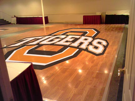
If you advertise in a supermarket, convenience store, exhibit hall or airport, you're constantly battling other posters and signage for awareness. Why not try something unique, something that will make you stand out from your competition? With point of purchase floor graphics from The Sign Studio, you'll have a unique tool to capture your customers' interest and encourage a call to action.
Customers tend to look down as they push shopping carts or wait in line to purchase their selections and a floor graphic, or decal or cling, is an easy, cost-effective way to grab their attention. It's especially valuable in driving last minute or impulse purchases. In fact, floor graphics can increase these purchases by 10%!
The Sign Studio has been producing and printing custom floor graphics for years. We understand the industry tricks, including bold graphics, strong messaging and die-cuts, to get your floor graphic noticed. Plus, we have the printing capabilities that make your graphics durable and long-lasting, so you can reach your most important customers day after day.
Contact The Sign Studio today to discover how and what we can do for you in an effort to increase your visibility in today's competitive marketplace. The Sign Studio - (818) 843-9200 or e-mail thesignstudio@sbcglobal.net
Banners
Instructions for Banner Installation and Maintenance
Nothing can add more impact to a promotion than an attractive banner and nothing can be less effective than a poorly displayed one. All of THE SIGN STUDIO banners are made with a durable nylon-reinforced vinyl that should last a long time when properly installed. To prevent tearing and ensure long life, follow the guidelines below.
INSTALLATION
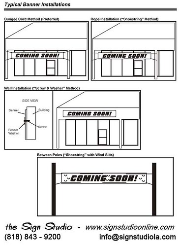
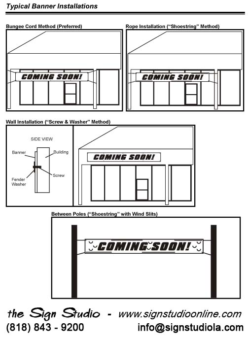
Banners are generally installed using one of three methods: stringing between two poles, directly mounting to a flat surface, or a combination of both.
STRINGING BETWEEN TWO POLES
When installing a banner between two poles, the main objective is to prevent an undue amount of stress on any one grommet hole. The best way to accomplish this is to hang the banner using bungee cords. Bungee cords will stretch with the banner allowing the wind to pass around the sides of the banner. Bungee cords also make the installation of your banner easier.
If you must use rope to hang your banner, follow these rules.
1. Determine how much rope is needed to tie off the banner. Be sure to give yourself a little extra length. If necessary, it can be trimmed later.
2. Weave the rope through the grommet holes from left to right (see diagram on reverse side). Do this for both the top and bottom of the banner.
3. Tie the top corners straight out and tight from the sides. Be sure the banner is centered and level before tying off the right side.
4. Tie the bottom corners at about a 15 degree angle down from the bottom edge of the banner leaving a slight amount of play in the rope. This will allow the air to escape out of the bottom of the banner.
NOTE: If the banner will be hung where it will be exposed to high winds (i.e. between two street poles), wind slits must be cut into the banner to allow air to pass through the banner. THE SIGN STUDIO can cut these wind slits for you when they are making the banner, or you can cut them yourself. A typical wind slit is a "smiley face" half circle, about 2" to 3" in diameter. They should be spaced about 12” to 18” apart. See the diagram on the reverse side for an example. Be sure not to cut slits through your graphics.
WALL INSTALLATION ("SCREW AND WASHER" METHOD)
If the banner is to be installed directly onto a wall, install it by driving screws through the grommet holes and into the wall.
1. Determine where you want the banner to be positioned.
2. Secure the top-left corner of the banner first.
3. Continue securing the banner across the top at each grommet hole, from left to right, making sure the banner is level.
4. Secure the bottom grommets from left to right.
CAUTION: When installing a banner directly onto a building, be careful because screws will leave permanent holes in the wall. Some surfaces may also require special fasteners to prevent the screws from pulling out. Before drilling, be sure to obtain landlord or property owner approval. If you have any doubts about installing a banner directly to a wall, refer the installation to a professional installer.
CITY ORDINANCES AND LANDLORD RESTRICTIONS
Before installing a banner, investigate local sign ordinances, and ask your landlord if any restrictions apply to displaying banners. If necessary, apply for permits at the city code enforcement department.
STORAGE AND MAINTENANCE
Banners should always be stored rolled up, with the lettering and graphics to the outside. A banner should never be folded, as doing so may cause vinyl graphics to pull away from the banner. If your banner becomes dirty, it can be cleaned with a soap and water mixture. Do not use any cleaning product that contains ammonia.
EXPECTATIONS: “It has been said that an outdoor banner is a sail without a ship. Be realistic in your expectations. While a banner is an excellent promotional sign, it is not a substitute for a permanent sign."
If you have any questions, feel free to call us AT (818) 843-9200 or e-mail us at info@signstudiola.com
Topics: Signs Los Angeles | Banner Installation and Mainte, banner install, banners burbank, banners pasadena, banners glendale, hollywood banners, west hollywood signs
SOLID METAL LETTERS - How beautiful and elegant they really are!
STAINLESS STEEL LETTERS
- Satin Grained Face or Polished – you just can’t go wrong with the look, absolutely gorgeous! Available sizes from 1” - 48” with thicknesses that range from 1/8” – ½” / Waterjet Flat Cut from solid 304 Alloy.
ALUMINUM LETTERS
- Satin Grained Face or Polished – Great pricing! Great look for economical prices. Available sizes from 1” – 48” with thicknesses that range from 1/8” – ½” / Waterjet Flat Cut from Solid 5052 Alloy.
BRASS LETTERS
- Satin Grained Face, Oxidized or Polished – Very Classy look! Available sizes from 1” – 48” with thicknesses that range from 1/8” – ½” / Waterjet Flat Cut from Solid 260 Alloy.
COPPER LETTERS
- Satin Grained Face, Mirror Polished, Verde Patina – Breathtaking! Available sizes from 1” – 48” with thicknesses that range from 1/8” – ½” / Waterjet Flat Cut from Solid 110 Alloy.
For further information or quotes, please contact us at The Sign Studio (818) 843-9200 or send us an e-mail with your request thesignstudio@sbcglobal.net.
Topics: metal letters, metal signs, aluminum letters, Los Angeles Signs | Solid Metal Letters, stainless steel letters
Magnetic Signs
Instructions for Magnetic Sign Installation and Maintenance
THE SIGN STUDIO uses the finest magnetic material to bring you the best in mobile magnetic advertising. Correct preparation, installation, maintenance, and storage procedures should be followed, see (Sections 1 – 4.) Following these instructions will help to ensure your satisfaction and to safeguard the long life of your signs and vehicle. Due to the many variables and complex nature of automotive finishes, special care must be taken to protect your vehicle: check the area behind the magnetic material weekly and move the sign as necessary to prevent any discoloration or clouding of the automotive clear coat.
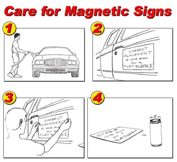
*** Note: A magnetic sign should never be applied to a newly painted vehicle. Allow at least 60 days for fresh paint to cure.
3. REMOVAL & MAINTENANCE: Remove the signs from your vehicle weekly. Always remove the sign by lifting from the center of the two opposite sides—never start at the corners, as this may stretch the sign material. In cold weather, preheat the sign with warm water before removal, if necessary. Once the signs are removed, wash and dry the vehicle and all sign surfaces. This keeps moisture from collecting between the signs and the vehicle surface, which can potentially damage a vehicle’s finish. To clean the signs, use a sponge and a mild soapy water solution. Never immerse the signs in water, steam clean, or take them through a car wash. A generous coat of wax on the surface where the sign is placed and on the back of the sign itself will help prevent damage. After rain or snowfall, remove signs and wipe dry.
4. STORAGE: Magnetic signs should be stored either on a flat, even surface, or rolled up (lettering to the outside) around a cylinder with a diameter of at least 3”. Never store magnetic signs in a hot vehicle, as they may permanently warp. Do not damage signs by folding, creasing , or placing any heavy objects on top of them. This type of treatment will prevent the signs from retaining their full magnetic power. If a sign does get bent out of shape, you can try to straighten it by placing it on a flat metal surface, such as a file cabinet or refrigerator. If you cannot straighten the sign, it will need to be replaced. WARNING: Automotive finishes and protectants vary by manufacturer; changes in color, shade, and surface appearance can occur with time, daily usage, and exposure to direct, intense sunlight. For care of your automotive finish, please refer to your vehicles Owner’s Manual.
Please give us a call at (818) 843-9200 or send us an e-mail at info@signstudiola.com if you have any further questions.
Topics: Los Angeles Signs | Vehicle Magnets - Care & Maint, vehicle signs, business identification signs, Logo Design, Vehicle Advertising
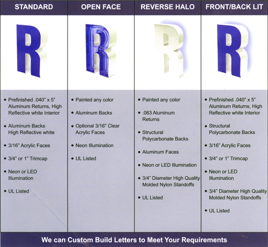
What style channel letter are you looking for? Here are some examples of the most common channel letters for your information.
If you have any questions or need any further information, please give us a call at (818) 843-9200 or email us at thesignstudio@sbcglobal.net
Topics: Channel Letters, signs la, LED Signs, Signs Los Angeles, Neon Signs, Sign Design
Here are a few helpful items. Some of LED illumination's potential advantages over neon are:
• LED is less fragile. Neon tubes are much more susceptible to breakage both in transit and during installation.
• LED can mean a lower utility bill for you. LED is a more efficient light source, and the electrical transformer is smaller.
• LED is a more focused light source. An LED module produces a "cone" of light, where neon illumination is emitted from all sides of the neon tube (this can also be a disadvantage for LED, as noted below.)
• Installation of an LED channel letter signs can be easier, as it does not always require conduit on the secondary side.
• LED is a more environmentally friendly product. Neon tubes often contain mercury.
• LED is safer to install, service and maintain. LED is typically powered by 12 volts DC, where neon is powered by 4,000 - 15,000 volts AC. The high voltages required by neon present a significantly higher electrical hazard potential.
However, with all of these differences, neon still has its place. Here is where neon illumination can be better:
• Neon illumination has a certain warm glow that many think LED has yet to match. This is particularly true for reverse and front/back lit channel letter signs. Neon's 360 degree illumination is very easy on the eyes when used with front/back lit letters. LED's focused "light cone" is not as good with these letter types.
• Some custom colors can be better matched with neon. If your client is concerned about a specific color match (such as a logo color), neon may be a better choice.
• Open face channel letter signs still require neon - LED is not yet a viable option.
So, the short answer to "which illumination source is better?" is that it all depends on the project at hand. LED and neon are completely different illumination sources, each with their own advantages and disadvantages.
If you have any questions or for further information, please contact The Sign Studio (818) 843-9200 or info@signstudiola.com.
Topics: LED Lighting, Channel Letter Signs, Signage, Neon, Signs
