Southern California Sign Blog

LOS ANGELES SIGNS | ALL YOU NEED TO KNOW ABOUT FONTS

Posted by Julie and Chris Ramirez on Fri, Jan 14, 2011 @ 17:01 PM

ALL YOU NEED TO KNOW ABOUT FONTS AND FONT DESIGN

In typography, a typeface is a set of one or more fonts, in one or more sizes, designed with stylistic unity, each comprising a coordinated set of glyphs. A typeface usually comprises an alphabet of letters, numerals, and punctuation marks. 

Font Characteristics resized 600

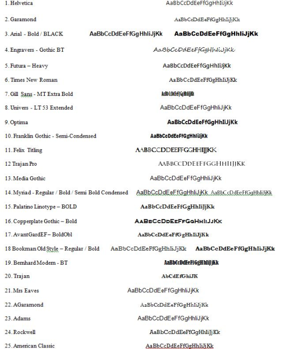
MY Top 25 Best Fonts Of  2010 - Below you will find the full list of the best and most popular 25 fonts we used last year.

25 Best Fonts resized 600

Have you ever had the problem of not knowing what typeface to use? Well of course you have, everyone has. This is a guide on how to choose a font.

These pointers have been gathered from Robin Williams great book “The Non-Designers Type Book” that I recommended in the top 5 typography resources of all time.

Think about each of these before choosing your next font.

Choose a category of type

Choose a type face that you think will match your work. ie. Oldstyle, Modern, Slab Serif, Sans Serif, Script, Decorative.

Quality of printer & paper

Where are you getting your piece printed? If you are printing from a low resolution printer, your subtle font characteristics such as delicate serifs or fine lines will not get printed. (eg. fax machines, photo copier). Is the paper going to without the ink and quality? eg. Newspapers will absorb ink and lose finer details.

How much text is there to read? What is its purpose?

Are you designing for a sign, billboard, poster, a book, a report? What is more important – readability or aesthetics? What is the purpose of the text? A serious look, a casual look, a decorative look?

How much space do you need to fill? Or leave unfilled?

Different typefaces take up different amounts of space, even at the same point size. Try comparing two fonts next to each other and see how much difference they take up in room.

Is the project to be skimmed or be really read?

Choose a typeface and layout that suits its purpose.

An exercise method for next time you choose a font…

Know your output method and final reproduction process to narrow down your font choices.

Decide on the look you want to convey.

If you use more than one font, make sure the fonts are very different from each   other. If they are not very different it looks like a mistake. eg. Use an oldstyle font for the body text and and a bold sans serif for the headline.

Don’t be afraid to use wild fonts where they are appropriate and use it sparingly. Don’t be a wimp.

How do you go about choosing a font or typeface?   Many people have asked me which text type is best for a magazine, a newspaper, a poster, a newsletter, a publication, etc. In general, I tell them which to use, but I know that this is not the best answer, because they won't learn to do this by themselves.
Today, I want to take time to analyze how to choose correct text typography design in different cases. It is very important to understand that these tips are not final word, but they can be good help at the moment of choosing a text type. In any case, it depends on what do you want to convey with this type, because many times legibility is as important as the character of the type. Try to be very careful and take in account the following points:

Fonts 3 1 resized 600
Fonts 3 2 resized 600

Topics: Fonts, Custom sign design in Burbank CA, custom fonts, most common fonts used

Signs Burbank | Sign Maintenance and HOW IMPORTANT it really is!

Posted by Julie and Chris Ramirez on Mon, Jan 10, 2011 @ 13:01 PM

Sign Maintenance and HOW IMPORTANT it really is!

Signage is the single, largest promotional tool you have. It is your way of saying to the public, "Hey! We're open for business and here to serve." Nice job! You've reminded your current customers that you are here ready to take care of their next need and you've introduced your business to future customers.
But what if your sign is in disrepair? What if the lights in and around your sign are out or the face is broken or dirty. Worse yet, what if it is outdated? Now what kind of impression or message are you communicating? It still reads "Hey - pick me" but it consciously and subconsciously causes your customers to read between the lines . . .

. . . and what they're reading isn't good!

It's saying, "maintenance and upkeep isn't a priority for this business and neither is quality or cleanliness." "If they care so little about their business, how could they possibly care about me, their customer?" What your sign has done is effectively set a negative expectation of your business in the mind of your customer. Your unkept sign defeated the very purpose for which it was intended.

Upkeep and freshening of your signage and lighting shouldn't be an afterthought; it should be a priority . . . protect your marketing investment and allow your signage to do what you intended - work for your business, not against it!

Something else to consider: On average, 46% of first-time customers find your business as a result of your sign. What would a 5 or 10% drop in sales mean to your bottom line simply because your sign was in disrepair or out of date?

Sign Maintenance is another area in which our personnel excel. Our 24/7 service department is on call and ready to serve your sign needs. From storm damage to national maintenance support to routine lamp outages, we have the parts, personnel, and knowledge on hand to make sure your sign maintenance needs are addressed in a timely fashion.

Call to schedule your service project TODAY (818) 843-9200 or send us an e-mail at thesignstudio@sbcglobal.net

Sign Maintenance graphic resized 600

Topics: Sign Maintenance, Sign Repair, Los Angeles Sign Maintenance, Orange County Sign Maintenance, Trouble Shoot Sign Problems

Burbank Signs | Evacuation Maps, Plans and Wayfinding Signs

Posted by Julie and Chris Ramirez on Tue, Jan 4, 2011 @ 10:01 AM

Evacuation Maps & Plans
Building evacuation plans, fire evacuation maps and emergency exit signs are essential to meet fire and building code requirements. The Sign Studio provides custom building evacuation maps and specialty signs. Building evacuation maps are carefully designed to meet all client and fire code requirements. Our exit signs and exit path marking systems are manufactured custom to your liking. Our building evacuation plans, stairtreads and path marking systems provide clear direction to exits and offer vital egress information and indicate the location of fire and safety equipment available.

Fire Evacuation Plans and Evacuation Diagrams
Public and commercial buildings (with 10 or more employees) are required by law to have an emergency action plan. An emergency action plan (EAP) details the actions employees and building occupants must take in the event of a crisis. The fire plan is a component of the EAP which emphasizes in-house fire safety protocols and procedures. The fire evacuation plan must include a schematic of the facility that details egress routes to fire exits, safety equipment locations, post evacuation assembly areas and other pertinent information. As a public safety measure, the authority having jurisdiction (Fire Marshal) requires that evacuation plans be posted for the building occupant.

What Are the Codes and Standards?
Much has been written into fire codes and occupational safety regulations about the necessity of posting fire evacuation diagrams. They are required by law in most facilities. Yet visit any number of buildings with posted fire evacuation signs and you will find as many different sign designs as there are buildings. With the absence of a nationally recognized standard to guide facility managers and sign designers with evacuation map development, we have to ask ourselves whether all building evacuation signs are equally effective? Can diagram size, color, floor plan orientation, text or icon styles affect viewer response during an emergency.

Our expert designers at The Sign Studio will design and prepare your layouts and work closely with you to create effective and proper Evacuation Maps and Signs for your needs. For more information or if you have any questions, please call us (818) 843-9200 or e-mail us at thesignstudio@sbcglobal.net.

Evac Maps resized 600

Topics: Wayfinding Signs, Evacuation Plan, Evac Maps, Evacuation Maps

BURBANK SIGNS | Public Notice Sign Requirements for DR

Posted by Julie and Chris Ramirez on Mon, Jan 3, 2011 @ 13:01 PM

DEVELOPMENT REVIEW
PUBLIC NOTICE SIGN REQUIREMENTS

Unless specifically waived, all applicants for Development Review (DR) are required to post a sign on the project site providing public notice of the pending development application.  This is in addition to the mailing of notices to nearby property owners and tenants.

Requirements for the design, construction and placement of the sign are as detailed below.

  1. The sign is to be erected on the project site at least 10 days prior to the Director’s Decision dated.  The sign is to be removed after the Development Review appeal period has ended.  If the determination is appealed, the sign is to be removed after the appeal has been decided. 
  2. Sign specifications and design:
    1. Size:   8 feet long by 4 feet tall
    2. Height:  Not to exceed 6 feed including support posts
    3. Location:  Not less than 1 foot inside front property line, clearly visible and facing street
    4. The sign must be constructed of plywood or a similar sturdy material.  Paper or cardboard is not acceptable.  The sign must be supported by two posts with a minimum size of 4 inches by 4 inches, with proper footing if required. 
    5. The background of the sign must be white with a border 1 to 4 inches thick.  The border must be black or another dark color that contrasts with the background. 
    6. Lettering must use a font that is readily legible and as large as possible given the amount of text necessary to fit on the sign.  The lettering must be black or another dark color that contrasts with the background.
    7. Sign format is subject to approval b the City Planner.
    8. Sign Copy: as shown below and in graphic.

Please see our sample below and if you have any questions or need The Sign Studio to prepare your design/layout and post & panel sign for you, please give us a call at (818) 843-9200 or send us an e-mail at thesignstudio@sbcglobal.net.

P & P resized 600


Topics: Burbank CA Sign Requirements, Public Notice, Development Review Signage

Signs Burbank | Sign Buyer's Questionnaire

Posted by Julie and Chris Ramirez on Thu, Dec 30, 2010 @ 19:12 PM

Sign Buyer's Checklist

Here's a quick questionnaire to help identify your signage needs and guide your SIGN STUDIO  consultant in making good recommendations for your project.

??  Use of your sign:
Are you directing, informing, or selling?

??  Image you want to project:
Professional? Sophisticated? Youthful? Fun? How should it coordinate with your other graphics and advertising?

 ??  Your target customers:
Whose attention do you want to attract?

??  Viewing distance and time:
How far will readers be from the sign? How long will they have to read it? 

??  Mounting your sign:
Where will the sign be displayed? How will it be attached? Will you need the approval of a landlord or local sign code authority?

??  Display time and conditions:
Temporary or permanent? Indoors or outdoors?
 

Sign copy and layout: What message do you want to communicate in your copy? Do you have special logo or layout requirements?

For further information or questions, please give us a call at (818) 843-9200 or send us an e-mail at thesignstudio@sbcglobal.net

Topics: burbank ca signs, signage los angeles ca, los angeles ca dimensional letters, pasadena ca dimensional signs, signs burbank ca, signs la, sign company los angeles, sign company burbank, sign company pasadena, sign company glendale, sign company west hollywood

Signs Burbank | Banner Finishing Options

Posted by Julie and Chris Ramirez on Wed, Dec 29, 2010 @ 07:12 AM

TYPICAL BANNER FINISHING OPTIONS - What will work for you?

GROMMETS:
Provide a convenient method for attaching the banner at regular points. This distributes the banner's weight and helps to keep the banner from sagging. Grommets are the most common method to hang banners.

HEMMED EDGES:
Hemmed edges are typically used to reinforce the sides of vinyl banners, helping maintain the banner's shape and prevent stretching.

POLE POCKETS:
Pole pockets allow for rigid poles to be inserted along the edges of the banner. This allows for a more even distribution of the banner's weight to prevent sagging. Opposing pole pockets can also be used to make the banner more rigid.

POWER TAPE:
Power tape reinforces the edges of shear cut banners or banners that have no material available for hemmed edges.

BANNER-UPS:
A plastic tab with eyelet attached to each corner of the banner. This creates convenient attachment points to have a banner.

D-RINGS WITH NYLON WEBBING:
D-Rings with nylon webbing are typically sewn into large banners that will hang on buildings. The D-rings allow the banner to be secured with ratchet straps.

NYLON WEBBING:
Webbing sewn into the top and bottom makes the banner stronger and significantly extends banner life. Webbing is typically used in areas subjected to higher wind loads.

If you have any questions, please give us a call at (818) 843-9200 or e-mail us at thesignstudio@sbcglobal.net.

Banner Finishing Options resized 600

Topics: Banner Installation, banner finishing options, grommets, banner-ups, pole pockets, nylon webbing, banner D-Rings, Banners

Signs Burbank | Dimensional Signs and Letters

Posted by Julie and Chris Ramirez on Tue, Dec 28, 2010 @ 07:12 AM

DIMENSIONAL LETTERS FOR YOU -

          Dimensional Letters and Logos provide a sophisticated, professional, and distinctive image.  Whether you're creating a simple sign on top of your headquarters or an intricate lobby display, your message deserves to stand out.  A great way to enhance the appeal of your business instantly.  Made with acrylic, wood, aluminum, PVC or a variety of sign foam to ensure of durability.  For further information or questions, please send us an e-mail at info@signstudiola.com or give us a call (818) 843-9200.  

 Dimensional Letters @ The Sign Studio, Burbank, CA

Topics: metal letters, dimensional signs, foam letters cut out letters, dimensional letters

Burbank Signs | Ready to Apply Vinyl Lettering Signs

Posted by Julie and Chris Ramirez on Mon, Dec 27, 2010 @ 07:12 AM

READY TO APPLY LETTERING – also known as RTA Lettering. 

If you are looking to save yourself some money and are confident in your application abilities, the following directions on how to apply your own vinyl lettering will help you to install your own signage. 

  1. Apply window cleaner, soapy water, or denatured alcohol to clean the surface where the lettering will be placed.  Use a lint-free cloth to wipe the surface dry. 
  2. Use a water-soluble pencil to draw guidelines and centerlines to help align the lettering. 
  3. Fill a spray bottle with a mixture of water and 3 drops of liquid dish detergent.
  4. Before applying, rest the lettering on a flat surface and carefully squeegee across the transfer tape that covers the bottom.
  5. Find the center of the lettering and make a small mark at that point on the transfer tape. 
  6. With the lettering face down, peel the backing paper away from the lettering, which will remain adhered to the transfer tape.
  7. Lightly spray the exposed sticky side of the lettering with the soapy water solution (if the letters are being applied to glass and are smaller than 1” in height, do not use the spray, it could cause misalignment.)  Small letters should be applied dry. 
  8. Place the lettering and transfer tape onto the surface, using any guidelines and centerlines you have made to help align the lettering.
  9. Squeegee the lettering from the center outward toward the edges, overlapping your strokes to prevent air and water from being trapped under the lettering.
  10. Leave the application tape attached to the lettering and let it dry for about one hour. 
  11. Remove the application tape.   Put the tape back at a 180-degree angle (flat) to the surface.  This will minimize the chance of the lettering being pulled up along with the tape. 

If you have any questions of need help with your Installation, please give us a call at (818) 843-9200 or e-mail us at thesignstudio@sbcglobal.net

 The Sign Studio, Burbank CA, RTA signs, vinyl graphics, vinyl application, vinyl signage

Topics: ready to apply vinyl letters, vinyl lettering, RTA lettering and vinyl, vinyl signs, vinyl decals

Burbank Signs | Channel Letter Glossary

Posted by Julie and Chris Ramirez on Mon, Dec 27, 2010 @ 07:12 AM

Channel Letter Glossary - Need a quick channel letter term definition? Here are a few common ones:

Acrylic: Translucent plastic used as a channel letter face material. Acrylic is available in a wide of colors, and its thickness is typically 1/8" or 3/16".

Channel Back: Aluminum that is routed in the shape of a letter to form its backing.

Cut-off switch: Electrical switch placed on the outside of the building, usually above, below or on a channel letter signs raceway.

Drain holes: Small holes placed at the bottom of a channel letter. Drain holes permit rain and condensation to drain out of a letter's interior.

Electrode: The terminal at the end of a neon tube that connects to a GTO wire. Neon tube fabricators attach electrodes to glass tubes by melting the glass to form an airtight weld.

GTO cable: Insulated electrical wire designed for high-voltage current. GTO cables connect neon tubes.

Electrode boot: A rubber boot designed to be installed on the double back or electrode of a neon tube to protect against electrical shocks or arcing.

LED: An electronic light source for channel letters. LED stands for Light Emitting Diode, and this type of lighting is illuminated by the movement of electrons in a semiconductor material. LED Channel letters are becoming more and more popular.

Neon: Another illumination option for channel letters, neon is a luminous glass tube filled with inert gas. High voltage electricity from a transformer excites the gas to produce light. Tubes may be bent to form various shapes and letters.

Permit: A legal document required by a municipal building department that allows the installation of a specific sign at a designated location. It is illegal to erect a new sign without first obtaining the appropriate permit.

Polycarbonate back: A protective plastic insert cut to the same shape as a reverse channel letter and attached to seal the letter's back. This prevents rainwater entry and also keeps animals from nesting inside the letter. Polycarbonate backs also provide mounting surfaces for neon tube supports.

Raceway: An enclosed aluminum channel (typically 8" by 8") that spans the entire length of the letters. Channel letters are pre-installed on the raceway in the shop, thus simplifying installation in the field.

Return: The side of a channel letter. Returns are commonly constructed of aluminum, and are typically 5" deep.

Tie wire: Thin copper wire that attaches a neon tube to a tube support.

Transformer: A channel letter's high-voltage power supply. Transformers are available in various current outputs, typically ranging from 7500V to 15,000V.

Trim cap: The flexible plastic edging that surrounds a channel letter's face. Trim caps are chemically welded to the face, and are available in a variety of colors.

Tube support: A glass standoff that typically is fastened to a channel letter back to hold neon tubing in place.

UL-approved: Underwriter's Laboratories (UL) is an independent product safety certification organization. UL approval means that all sign components meet UL standards for electrical safety.

If you have any questions, please give us a call at (818) 843-9200 or send us an e-mail at thesignstudio@sbcglobal.net

IMG resized 600

Topics: Channel Letters, burbank ca signs, Channel Letter Signs, Illuminated Channel Letters, ul approved, trim cap, transformer, sign raceway

Burbank Signs | Trade Show Graphics Checklist

Posted by Julie and Chris Ramirez on Sun, Dec 26, 2010 @ 07:12 AM

Trade Show Graphics Checklist:

Your Sign Studio consultant knows all the tricks of the trade show.

We'll help you:

 - Create a striking design that communicates a clear message and business image.

 - Distill your product information into easy-to-read, bullet-pointed copy.

 - Choose the right color scheme that complements your logo and shows off your products.

 - Select a booth and graphic materials that are durable and lightweight for easy, affordable transport and storage.  

 - Strategically position graphics to guide traffic flow in and out of your booth space.

 - Keep your trade show booth on budget while also achieving a highly effective, professional look.

The Sign Studio has everything you need to create a powerful trade show exhibition.

Contact us at (818) 843-9200 or send us an e-mail at info@signstudiola.com for assistance.

Topics: tradeshow signs, graphics for tradeshow, sign graphics for tradeshow