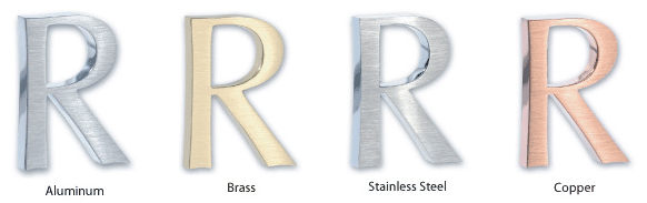
Southern California Sign Blog

Signs Burbank | Effective signs for you and your business.

Posted by Julie and Chris Ramirez on Sat, Dec 25, 2010 @ 07:12 AM

Signs and graphics serve three general purposes: to inform, direct and sell. The initial impression a person has about a business is often the result of their signs and graphics. By employing effective signs and graphics, businesses of all types and sizes can make the most of that first impression.

Signs are valuable to businesses of all sizes, and in all industries. Signs help consumers become aware of a business, service or event, can help prompt purchases, change purchase decisions and build brand equity.

Signage is an inexpensive, yet very effective form of advertising. During a slow economy, advertising is crucial and it helps create a long-term competitive advantage. Maintaining an advertising presence through signs helps build long-term brand awareness.

Effective signage can also be a determining factor in influencing customers to switch from a weaker brand. What can effective signs and graphics do for you?

Contact The Sign Studio @ (818) 843-9200 or send us an e-mail - info@signstudiola.com.

Topics: Effective Signs, sign advice, Sign Design, sign advertising

Signs Burbank | Sign Color Chart - colors have personality

Posted by Julie and Chris Ramirez on Fri, Dec 24, 2010 @ 07:12 AM

Different colors and fonts appeal to different personalities, and if you really want signs that attract, you'll make an effort to understand to whom what color goes with your personality. Here are the most common examples and top 3 colors used:

The Sign Studio in Burbank CA - Sign Color Chart

Red:  Red is exciting and active - it suggests boldness and efficiency, and is appetite-inspiring, hence McDonald's use of red (as well as yellows and oranges).  As you can see, red especially appeals to "Emulators," or people who are sales-oriented and talkative.  Red implies urgency.

Blue:  Blue is the most widely used color in appealing to businesspeople and entrepreneurs called "Achievers."  Blue is serene, suggesting wisdom, dignity, and stability, hence the wide use of blue by banks.  Men prefer blue to red and are supposed to prefer blue to red because it is more restful to the eye.  Blue is businesslike. 

Green:  Green and other earth-tone colors appeal to the vast group called "Belongers."  These people are the "middle America" people - usually employees, family people, and definitely relationship-oriented.  They enjoy green, browns and golds.  Earth-tones are friendly. 

If you are interested in more color analysis or color combinations, please give us a call at (818) 843-9200 or send us an e-mail at info@signstudiola.com


Topics: sign color chart, sign planning, sign colors, Sign Design

Signs Burbank | Architectural Signage

Posted by Julie and Chris Ramirez on Thu, Dec 23, 2010 @ 07:12 AM

ARCHITECTURAL SIGNAGE- does more than communicates a message. Architectural signage must also help build the brand name of the company it serves. Success depends not only on precision craftsmanship but also on cutting edge design and carefully selected materials that will best represent the finished product.

Planning for Precision and Durability

Architectural signs

Creating quality architectural signage means understanding the details and planning for the obstacles involved. The challenges are somewhat different depending on whether you are creating signage for indoor or outdoor use.The challenge on indoor signage is to have a degree of precision that is unsurpassed. With exterior signage the tolerances do not have to be quite as precise, but there are other challenges that are just as significant, such as weather conditions and environment. Interior signs are in air conditioned environments but with exterior items we have to worry about sunlight, humidity, heat, cold and so on.

Understanding How Lighting Impacts Display
Fade resistant materials are important to protect both indoor and outdoor architectural signage from the sun and understanding the impact of ambient lighting is also a key challenge.

Choosing the Right Materials for the Job
Between durability and lighting concerns, choosing the right materials for architectural signage can be a major obstacle for the novice. Avoid lower end plastic products, they look cheap.

Special Considerations in the Design Phase
The actual "look" of a sign is the focus of most everyone's attention. The primary challenges in the design phase is coming up with a look that the everyone wants and choosing materials while staying within budgets. It is important to choose materials in the design phase so that you can prepare for any special requirements, such as lighting, mounting, or curved walls.

For further Information or if you have any questions, please call The Sign Studio @ (818) 843-9200 or send an e-mail to thesignstudio@sbcglobal.net.


Topics: Architectural Signs, design signs, sign plans, burbank ca signs, los angeles ca signs

Signs Burbank | Banner Installation Methods

Posted by Julie and Chris Ramirez on Wed, Dec 22, 2010 @ 07:12 AM

Banner Installation Methods

Want to save money and install your own banner? If so, here are some typical banner installation methods. Banners are generally installed using one of these four methods.

The Sign Studio, Burbank, CA, Banner Installation, banner install methods, banner maintenance, banners la, banners los angeles

Topics: Banner Installation, banners los angeles ca, banners la

Burbank Signs | Sign Lettering Font Tips

Posted by Julie and Chris Ramirez on Tue, Dec 21, 2010 @ 07:12 AM

Sign Lettering Font Tips

Use simple block fonts when creating signs that need to be readable from a distance. A more stylish font may be harder to read and required to be set at a larger size. You should never set a script or cursive font in all capitals, the results will be very hard to read. Avoid using a heavy or fancy headline font for large passages of text. Use fancy lettering where type needs to draw attention to itself, such as a logo or a headline. Use more conservative looking type where items need to be subdued or merely listed, such as large areas of text, sub-headlines and items in a list. 

If you need further assistance, please call The Sign Studio (818) 843-9200 or e-mail us at thesignstudio@sbcglobal.net

Topics: sign fonts, sign lettering

Burbank Signs | ADA Signs, ADA Tactile & Braille Guidelines

Posted by Julie and Chris Ramirez on Mon, Dec 20, 2010 @ 07:12 AM

ADA Tactile & Braille Signage

The ADA Tactile & Braille Signage Code is a wide-ranging civil rights law that prohibits, under certain circumstances, discrimination based on disability. The lack of accessibility or certain services can be considered discrimination, regardless of who it actually affects. This creates a need for ADA compliant signs. No individual may be discriminated against on the basis of disability with regards to the full and equal enjoyment of the goods, services, facilities, or accommodations. When the law was first put into effect, there was a problem with ADA signs not being esthetically pleasing. Now that it's been in existence for some time, the question of esthetics has been resolved and the industry faces new problems with ADA signs. We continually add articles to this section, so be sure to check back often.

ADA Guidelines
Letters can't be smaller than 5/8-inch or larger than 2 inches. All letters must be a minimum 3/32 inches thick for tactility. And, generally, you cannot use elaborate or decorative fonts. San Serif fonts, like Helvetica, are the staple of most ADA signs. It may sound restrictive, and it is at some level, but the goal is not to stifle creativity. The goal is to serve an intended audience.

While ADA guidelines define font size, contrast and other criteria, the law does not define specific design criteria as it relates to aesthetics. Letter height, Braille placement, font, and color contrast make only minimal impacts on the visual appearance. There are ways to make ADA signage more attractive while still adhering to the guidelines.

ADA Materials
ADA-compliant materials are one way to make the difference between a ho-hum sign and an attractive presentation. Sign frames with the ability to change printed inserts are another. Finally, understanding what the guidelines really say about color contrast and icons could give you more freedom than you thought. Signs can be designed and made from an amazing variety of materials ranging from basic plastics to very elaborate designs of natural stone, woods, or metals.

For further information or questions, please call The Sign Studio (818) 843-9200 or e-mail us at thesignstudio@sbcglobal.net


Topics: ada signs; ada tactile and braille signs, ada compliant, ada sign materials

Signs Burbank | Solid Metal Letters

Posted by Julie and Chris Ramirez on Sun, Dec 19, 2010 @ 13:12 PM

SOLID METAL LETTERS - How beautiful and elegant they really are!describe the image

STAINLESS STEEL LETTERS

-          Satin Grained Face or Polished – you just can’t go wrong with the look, absolutely gorgeous! Available sizes from 1” -  48” with thicknesses that range from 1/8” – ½” / Waterjet Flat Cut from solid 304 Alloy.

ALUMINUM LETTERS

-          Satin Grained Face or Polished – Great pricing! Great look for economical prices.  Available sizes from 1” – 48” with thicknesses that range from 1/8” – ½” / Waterjet Flat Cut from Solid 5052 Alloy.

BRASS LETTERS

-          Satin Grained Face, Oxidized or Polished – Very Classy look!  Available sizes from 1” – 48” with thicknesses that range from 1/8” – ½” / Waterjet Flat Cut from Solid 260 Alloy.

COPPER LETTERS

-          Satin Grained Face,  Mirror Polished, Verde Patina – Breathtaking! Available sizes from 1” – 48” with thicknesses that range from 1/8” – ½” / Waterjet Flat Cut from Solid 110 Alloy.

For further information or quotes, please contact us at The Sign Studio (818) 843-9200 or send us an e-mail with your request thesignstudio@sbcglobal.net.

Topics: metal letters, aluminum letters, los angeles signs, brass and stainless letters and signs, copper signs, Burbank Signs

Los Angeles Signs | Floor Graphics, Decals & Clings

Posted by Julie and Chris Ramirez on Wed, Dec 8, 2010 @ 19:12 PM

Floor graphic advertising is a unique way to put your message in front of and under current and potential customers.

Oxy Floor Decal resized 600

If you advertise in a supermarket, convenience store, exhibit hall or airport, you're constantly battling other posters and signage for awareness. Why not try something unique, something that will make you stand out from your competition? With point of purchase floor graphics from The Sign Studio, you'll have a unique tool to capture your customers' interest and encourage a call to action.

Customers tend to look down as they push shopping carts or wait in line to purchase their selections and a floor graphic, or decal or cling, is an easy, cost-effective way to grab their attention. It's especially valuable in driving last minute or impulse purchases. In fact, floor graphics can increase these purchases by 10%!

The Sign Studio has been producing and printing custom floor graphics for years. We understand the industry tricks, including bold graphics, strong messaging and die-cuts, to get your floor graphic noticed. Plus, we have the printing capabilities that make your graphics durable and long-lasting, so you can reach your most important customers day after day.

Contact The Sign Studio today to discover how and what we can do for you in an effort to increase your visibility in today's competitive marketplace.  The Sign Studio - (818) 843-9200 or e-mail thesignstudio@sbcglobal.net

NEED QUOTE

Topics: Los Angeles Signs | Floor Graphics, Decals & Clings

Signs Los Angeles | Banner Installation and Maintenance

Posted by Julie and Chris Ramirez on Tue, Dec 7, 2010 @ 07:12 AM

Banners

Instructions for Banner Installation and Maintenance

Nothing can add more impact to a promotion than an attractive banner and nothing can be less effective than a poorly displayed one. All of  THE SIGN STUDIO banners are made with a durable nylon-reinforced vinyl that should last a long time when properly installed. To prevent tearing and ensure long life, follow the guidelines below.

Banner Care 02 resized 600

INSTALLATION
Banners are generally installed using one of three methods: stringing between two poles, directly mounting to a flat surface, or a combination of both.

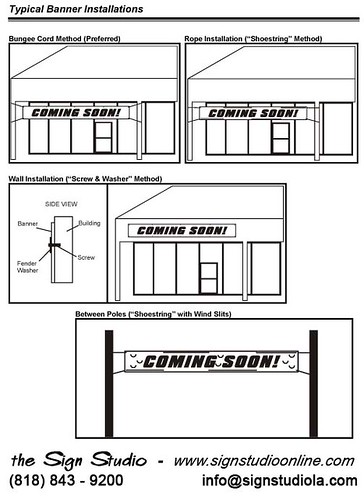
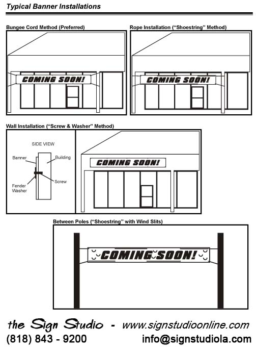
STRINGING BETWEEN TWO POLES
When installing a banner between two poles, the main objective is to prevent an undue amount of stress on any one grommet hole. The best way to accomplish this is to hang the banner using bungee cords. Bungee cords will stretch with the banner allowing the wind to pass around the sides of the banner. Bungee cords also make the installation of your banner easier.

If you must use rope to hang your banner, follow these rules.

1. Determine how much rope is needed to tie off the banner. Be sure to give yourself a little extra length. If necessary, it can be trimmed later.

2. Weave the rope through the grommet holes from left to right (see diagram on reverse side). Do this for both the top and bottom of the banner.

3. Tie the top corners straight out and tight from the sides. Be sure the banner is centered and level before tying off the right side.

4. Tie the bottom corners at about a 15 degree angle down from the bottom edge of the banner leaving a slight amount of play in the rope. This will allow the air to escape out of the bottom of the banner.

NOTE: If the banner will be hung where it will be exposed to high winds (i.e. between two street poles), wind slits must be cut into the banner to allow air to pass through the banner.  THE SIGN STUDIO can cut these wind slits for you when they are making the banner, or you can cut them yourself. A typical wind slit is a "smiley face" half circle, about 2" to 3" in diameter. They should be spaced about 12” to 18” apart. See the diagram on the reverse side for an example. Be sure not to cut slits through your graphics.


WALL INSTALLATION ("SCREW AND WASHER" METHOD)

If the banner is to be installed directly onto a wall, install it by driving screws through the grommet holes and into the wall.

1. Determine where you want the banner to be positioned.

2. Secure the top-left corner of the banner first.

3. Continue securing the banner across the top at each grommet hole, from left to right, making sure the banner is level.

4. Secure the bottom grommets from left to right.

CAUTION: When installing a banner directly onto a building, be careful because screws will leave permanent holes in the wall. Some surfaces may also require special fasteners to prevent the screws from pulling out. Before drilling, be sure to obtain landlord or property owner approval. If you have any doubts about installing a banner directly to a wall, refer the installation to a professional installer.

CITY ORDINANCES AND LANDLORD RESTRICTIONS

Before installing a banner, investigate local sign ordinances, and ask your landlord if any restrictions apply to displaying banners. If necessary, apply for permits at the city code enforcement department.

STORAGE AND MAINTENANCE

Banners should always be stored rolled up, with the lettering and graphics to the outside. A banner should never be folded, as doing so may cause vinyl graphics to pull away from the banner. If your banner becomes dirty, it can be cleaned with a soap and water mixture. Do not use any cleaning product that contains ammonia.

EXPECTATIONS: “It has been said that an outdoor banner is a sail without a ship. Be realistic in your expectations. While a banner is an excellent promotional sign, it is not a substitute for a permanent sign."

If you have any questions, feel free to call us AT (818) 843-9200 or e-mail us at info@signstudiola.com

Topics: Signs Los Angeles | Banner Installation and Mainte, banner install, banners burbank, banners pasadena, banners glendale, hollywood banners, west hollywood signs

Los Angeles Signs | Solid Metal Letters

Posted by Julie and Chris Ramirez on Mon, Dec 6, 2010 @ 15:12 PM

SOLID METAL LETTERS - How beautiful and elegant they really are!

Metal Letters resized 600

STAINLESS STEEL LETTERS

-          Satin Grained Face or Polished – you just can’t go wrong with the look, absolutely gorgeous! Available sizes from 1” -  48” with thicknesses that range from 1/8” – ½” / Waterjet Flat Cut from solid 304 Alloy.

ALUMINUM LETTERS

-          Satin Grained Face or Polished – Great pricing! Great look for economical prices.  Available sizes from 1” – 48” with thicknesses that range from 1/8” – ½” / Waterjet Flat Cut from Solid 5052 Alloy.

BRASS LETTERS

-          Satin Grained Face, Oxidized or Polished – Very Classy look!  Available sizes from 1” – 48” with thicknesses that range from 1/8” – ½” / Waterjet Flat Cut from Solid 260 Alloy.

COPPER LETTERS

-          Satin Grained Face,  Mirror Polished, Verde Patina – Breathtaking! Available sizes from 1” – 48” with thicknesses that range from 1/8” – ½” / Waterjet Flat Cut from Solid 110 Alloy.

For further information or quotes, please contact us at The Sign Studio (818) 843-9200 or send us an e-mail with your request thesignstudio@sbcglobal.net.

Topics: metal letters, metal signs, aluminum letters, Los Angeles Signs | Solid Metal Letters, stainless steel letters