Southern California Sign Blog

Sign Variance and Sign Permits - Do You Need A Sign Variance?

Posted by Julie and Chris Ramirez on Wed, Apr 11, 2012 @ 06:04 AM

Do You Need Or Want A Sign Variance?

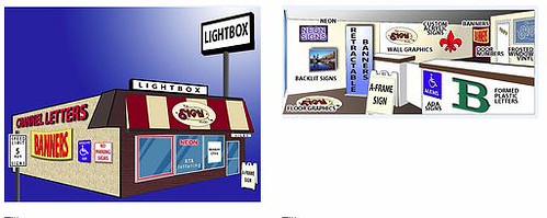
SIGN VARIANCE - What is that? Why do I need a Sign Variance?

It is important to work with your sign professional and local zoning department when designing your business signage. A quick check on the zoning/building code will give you a guideline to use when developing your signage.

Sign Variance Picture

Sign variances become necessary when unique circumstances exist for a property that do not allow for adequate identification of the business. Most sign variances are requested for the purpose of exceeding a municipality's square footage or setback allowances. A quasi-judicial board of elected community members will hear your case and make a decision based on the characteristics of your specific request. Many communities request that you consider and provide answers to the Duncan Factors (used for consideration of area requests).

These are seven factors which the board must answer before approving your variance request. Please find these factors, summarized below:

1). Will the property provide a reasonable return without the variance?
2). Is the variance substantial?
3). Will the surrounding properties be adversely effected by the variance?
4). Will the variance inhibit government services (fire, police, ems)?
5). Is the hardship self-inflicted?
6). Is there a reasonable alternative to this variance?
7). Does the variance follow with the keeping of the zoning code? (Minimum amount needed)

If you have any further questions or need any information, please contact The Sign Studio at (818) 843-9200 or send us an e-mail at thesignstudio@sbcglobal.net.

NEED QUOTE

Sign Quote


Topics: Sign Permits, Sign Design, Sign Variance

What kind of Font should I use to design my sign? Sign Design

Posted by Julie and Chris Ramirez on Thu, Feb 23, 2012 @ 06:02 AM

What kind of Font should I use to design my sign?  Sign Design........

Sign Lettering Font Tips

Use simple block fonts when creating signs that need to be readable from a distance. A more stylish font may be harder to read and required to be set at a larger size. You should never set a script or cursive font in all capitals, the results will be very hard to read. Try to avoid using a heavy or fancy headline font for large passages of text. Use fancy lettering where type needs to draw attention to itself, such as a logo or a headline. Try to use more conservative looking type where items need to be subdued or merely listed, such as large areas of text, sub-headlines and items in a list.

If you need further assistance, please call The Sign Studio (818) 843-9200 or e-mail us at thesignstudio@sbcglobal.net

Sign Font Images

Quote for Signage

Topics: sign fonts, Sign Tips, Sign Design

Signs Los Angeles | Signage Design and Specification

Posted by Julie and Chris Ramirez on Fri, Jan 6, 2012 @ 06:01 AM

SIGNAGE DESIGN AND SPECIFICATION

Whether your project involves signage, wayfinding, branding or a combination of these disciplines, it is important that the design and documentation be taken seriously. Our goal is to design and document a solution that will best fit our client's brief. Research and in-depth analysis will ensure success throughout this phase.

Signage Design

The Sign Studio's design process always commences with a detailed briefing session to understand the needs of the client. Our designers then commence research and based on the findings, sketches and initial design concepts are prepared. From these initial designs, a final concept is worked towards by working closely with the client.

Signage Prototyping

Prototyping can then be produced that enable the client to visualize, touch and feel the finalized concepts. It confirms if the designs are practical and suitable for the built environment in which they will be placed.

Signage Specification and Documentation

Once the prototypes have been approved, the documentation process can begin. The final sign design concepts will be developed into detailed 2D and/or 3D drawings including specifications. Specifications usually include, but are not limited to: dimensions, materials, finishes, visuals, site plans or in mockups and shop drawings, and assembly detail, etc.

 
Sign Design Image

If you have any questions or need further information, please give us a call at (818) 843-9200 or visit our website at www.signstudiola.com – You can also reach us by e-mail at info@signstudiola.com

Topics: Sign specifications, Sign Design, Custom Signs

Signs Los Angeles | Design Tips For Outdoor Signs

Posted by Julie and Chris Ramirez on Wed, Nov 9, 2011 @ 06:11 AM

Design Tips For Outdoor Signs

An outdoor sign is important to any type of business. When it comes to the design of signs there are a few design tips you should keep in mind in order for your sign to be as effective as possible. Here are the top 10 design Tips for effective signage:

1. Make sure your sign is visible and legible

It is very important that the majority of people passing by your business are able to see and read your sign with ease. People are driving past your business 24 hours a day. Make sure you are getting your message across to them clearly.

2. Grab the Readers attention

Your sign should command the attention of people passing by. There should be something about your sign that makes people literally take a double take. Use large dominating text and pictorial graphics.

3. Keep things simple

Do not crowd your sign with too many words. This can make your sign very hard to read from a distance. Use as few words as possible. This is critical in order for your sign to be effective.

4. Use Technologies

Add the time and temperature to your display. You can also use an Electronic Variable Message Center. This can help make your business a community landmark. The addition of a Time and Temperature display or an Electronic Variable Message Center can make your business a landmark in your community. Using an electronic message center will give you the ability to change the message on your sign whenever you please.

5. Appeal to impulse buyers

Did you know that at least 55% of all retail sales are because of impulse buyers? Too many business owners make the mistake of thinking that a sign is just a way to identify their business.

6. Keep the sign in plain sight

Put the sign as close to the street as the law allows. You want to make sure everyone passing by sees what you have to offer.

7. Avoid obstructions

It is very important that you make sure your sign can be viewed without obstruction from any source. Get in your car and drive past your business from every angle possible. This will help you determine how visible your sign is or isn’t.

8. Make your sign memorable

The message on your sign should be easy to remember. Use pictures, slogans and anything that will make potential customers remember your products and location.

9. Avoid clutter

At least 30% of the sign’s face area should be left as white space. You don’t want to add too much to your sign. Clutter will make your message very hard to read. There must be a balance between white space and graphics and text.

10. Make it enticing

Your sign should intrigue your potential customer so much that they can’t help but stop and see what you have to offer. Be creative.

Your sign is often times considered your first impression. Make sure you keep the 10 steps above in mind when considering what message to put on your sign. You want to make sure your sign is effective.

If you have any questions or need further information, please give us a call at (818) 843-9200 or visit our website at www.signstudiola.com – You can also reach us by e-mail at info@signstudiola.com

NEED QUOTE

Sign Color and Visability Chart

Topics: Sign Design, Outdoor and Indoor Signs, New Signs

Los Angeles Signs | From Concept to Finish at The Sign Studio!

Posted by Julie and Chris Ramirez on Mon, Sep 26, 2011 @ 06:09 AM

A journey from concept to completion at The Sign Studio!

A business with no sign is a sign of no business! This is the mantra behind the success of The Sign Studio. Signs increase traffic and lead to higher sales and success for businesses.

The Sign Studio not only offers custom designed signs and banners, but sign repair and installation, sign removal and even sign site surveys to ensure your sign will get the most exposure. The Sign Studio will even design a logo for the sign to stand out and represent the company in its brightest light. The highest technology is used to create these high impact, cost effective signs to boost business. We produce indoor and outdoor signs as well as illuminated, non-illuminated and even banners of any size.

The team at The Sign Studio promises to make your journey to a successful business easy. We begin by developing a cost effective design and logo. Each client is considered a friend in this journey. As the projects blossom from paper to reality each sign is fabricated with the highest technology possible. Signs are then installed at your location of choice.

We are all about the highest comfort and guarantee to our customers.

From concept to completion The Sign Studio will help you have a successful business. Let us do your signage while you grow your business.....

If you have any questions or need assistance with anything, please give us a call at The Sign Studio -  (818) 843-9200 or send us an e-mail at info@signstudiola.com.

NEED QUOTE

Sign Maintenance, Sign Upkeep, Sign Problems

Topics: Sign Repair and Installation, Sign Permits, Sign Design

Los Angeles Signs | History of the Most Popular Fonts Used for Signs

Posted by Julie and Chris Ramirez on Sat, Sep 10, 2011 @ 06:09 AM

What is the History of Popular Fonts Used for Signs?  

“What’s the best font to use on a sign?”

It’s a question that The Sign Studio team members face frequently. While there is no one perfect answer for every situation, there are some fonts that have endured through the years to become staples in visual communications, DIN 1451, Frutiger, Gill Sans and Helvetica are classic fonts that have helped countless people reach their destinations throughout the decades.

DIN 1451 isn’t a promising name for a good communicator, but it has been used since the 1930s for scientific and traffic signs. The name is an acronym for the German Deutsches Institut für Normung (German Institute for Standardization). In 1936 the German Standard Committee named DIN 1451 the official typeface for technology, administration, engineering, traffic and business. The medium version of this font was popular with graphic designers in the 1980’s and today it is frequently used for identification on vehicles and as cast metal lettering for street and building signage.

Frutiger is a typeface commissioned in 1968 by the Charles De Gaulle International Airport for new directional signs. Type designer Adrian Frutiger was told to create a modern font that had excellent visibility at various angles, sizes and distances. This highly legible font with a warm personality is a favorite in the advertising industry. In 2008 it was the fifth best-selling typeface of the Linotype foundry. It is used throughout the public transit network in Norway since the 1980s.

In 1929 Eric Gill was commissioned to produce Gill Sans for the London and North Eastern Railway (LNER). It was first presented in a single uppercase weight and became very popular immediately. It was the standard typeface for all LNER posters, locomotive nameplates, station signage and even the menu on the dining cars. More recently, the BBC adopted Gill Sans for its corporate typeface in 1997. The British Government formally adopted Gill Sans as its standard typeface for use in all communications and logos in 2003.

Helvetica is another classic font, so popular it even inspired its own film. The U.S. Government uses Helvetica for everything from federal tax forms to NASA’s Space Shuttle orbiter. It is also used for the U.S. television rating system. Helvetica was adopted as the official font for all of New York City’s Metropolitan Transportation Authority in 1989. The Chicago Transit Authority uses Helvetica for the city’s elevated train system and Philadelphia’s SEPTA uses it exclusively for all signage.

To learn more about the history of classic fonts, visit this excellent post from the Live Well Collaborative.

If you have any questions or need assistance with anything, please give us a call at The Sign Studio (818) 843-9200 or send us an e-mail at info@signstudiola.com.

Topics: sign fonts, Fonts, Sign Design

Signs Los Angeles | Design and Installation Experts for your Signage!

Posted by Julie and Chris Ramirez on Tue, Aug 16, 2011 @ 06:08 AM

Your signage design and installation experts in LA County!

The Sign Studio specializes in signs of all kinds and is the one-stop shopping place for sign installation in LA County and surrounding areas. Whether you're just starting up and need to get your name out there or your company is already wildly successful, chances are, you need signs. Make the most of your marketing budget and let The Sign Studio handle your sign and banner installation needs. We've been serving Glendale, Burbank, Pasadena and the greater Los Angeles area for many years and have created signs and banners for some of the most successful businesses around. Now we're ready to put our experience and expertise to work for you. Drive new customers to your door with our eye-catching vehicle signs, or increase your visibility with window graphics, illuminated signs or updated dimensional lettering.

Our business can help you do big business by increasing your visibility, updating your logo or flying your flag with banners and directional signs. Let our skilled graphic artists and craftsman turn your great ideas into reality with our wide variety of techniques and materials. We'll take care of everything, from the design table to sign installation. Because all we do is signs, we do it well, and with The Sign Studio as your signage design and installation experts in LA County, you can get back to running your business while we go about the business of getting your name and your message up there, out there and pretty much anywhere you need it to be!

If you have any questions or need assistance with anything, please give us a call at The Sign Studio (818) 843-9200 or send us an e-mail at info@signstudiola.com.
NEED QUOTE

Custom Signage Image

Topics: Sign Design, Signs, Sign Installation

Signs Burbank | Effective signs for you and your business.

Posted by Julie and Chris Ramirez on Sat, Dec 25, 2010 @ 07:12 AM

Signs and graphics serve three general purposes: to inform, direct and sell. The initial impression a person has about a business is often the result of their signs and graphics. By employing effective signs and graphics, businesses of all types and sizes can make the most of that first impression.

Signs are valuable to businesses of all sizes, and in all industries. Signs help consumers become aware of a business, service or event, can help prompt purchases, change purchase decisions and build brand equity.

Signage is an inexpensive, yet very effective form of advertising. During a slow economy, advertising is crucial and it helps create a long-term competitive advantage. Maintaining an advertising presence through signs helps build long-term brand awareness.

Effective signage can also be a determining factor in influencing customers to switch from a weaker brand. What can effective signs and graphics do for you?

Contact The Sign Studio @ (818) 843-9200 or send us an e-mail - info@signstudiola.com.

Topics: Effective Signs, sign advice, Sign Design, sign advertising

Signs Burbank | Sign Color Chart - colors have personality

Posted by Julie and Chris Ramirez on Fri, Dec 24, 2010 @ 07:12 AM

Different colors and fonts appeal to different personalities, and if you really want signs that attract, you'll make an effort to understand to whom what color goes with your personality. Here are the most common examples and top 3 colors used:

The Sign Studio in Burbank CA - Sign Color Chart

Red:  Red is exciting and active - it suggests boldness and efficiency, and is appetite-inspiring, hence McDonald's use of red (as well as yellows and oranges).  As you can see, red especially appeals to "Emulators," or people who are sales-oriented and talkative.  Red implies urgency.

Blue:  Blue is the most widely used color in appealing to businesspeople and entrepreneurs called "Achievers."  Blue is serene, suggesting wisdom, dignity, and stability, hence the wide use of blue by banks.  Men prefer blue to red and are supposed to prefer blue to red because it is more restful to the eye.  Blue is businesslike. 

Green:  Green and other earth-tone colors appeal to the vast group called "Belongers."  These people are the "middle America" people - usually employees, family people, and definitely relationship-oriented.  They enjoy green, browns and golds.  Earth-tones are friendly. 

If you are interested in more color analysis or color combinations, please give us a call at (818) 843-9200 or send us an e-mail at info@signstudiola.com


Topics: sign color chart, sign planning, sign colors, Sign Design

Los Angeles Signs | What Channel Letter is best for you?

Posted by Julie and Chris Ramirez on Tue, Nov 30, 2010 @ 00:11 AM

What style channel letter are you looking for?  Here are some examples of the most common channel letters for your information. 

If you have any questions or need any further information, please give us a call at (818) 843-9200 or email us at thesignstudio@sbcglobal.net

NEED QUOTE

Channel Letter Blog Picture resized 600

Topics: Channel Letters, signs la, LED Signs, Signs Los Angeles, Neon Signs, Sign Design